
 When you're planning to make changes to your website, it helps to poke around other companies' websites to see what they're up to. How have they structured their navigations? Do they still use hero images? How many CTAs do they have? What do their mobile websites look like?
While you're certainly not trying to copy features exactly, seeing what others are doing can help you figure out what's new in the fast-paced world of design and inspire new ideas for your own site.
Trouble is, it can be hard to randomly stumble across lots of great examples. So we decided to curate some in this very post to help inspire your next redesign.
Before we dive into the websites themselves, it's important to note that not every design is meant to look like Apple’s website and aesthetic. Of course everyone loves a “beautiful website” and smooth customer experience, but the end goal of any website is great usability - and that can have multiple definitions depending on your site purpose and target audience.
Some designs you’ll love, others you’ll hate, and some you’ll think are just mediocre, but the important thing is that you’ll see and think about design elements that you hadn’t before. Take a moment to understand why a site might have been designed a certain way. A few tactics you might look for include:
- Use of imagery
- Use of video
- Use of colors
- Use and sizing of fonts
- Logo placement
- CTA placement
- Responsive design
- Social media links
- Search box
- Headlines
- Punctuation
- Menu bars
- Box design
 The point of reviewing these designs isn’t for you to love all of them, but rather to find a few interesting design tactics that you can take back to your team. Let's get to it.
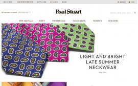
Why we like this site:
The homepage does a few things well. First, site visitors are drawn to the screen by seeing visually captivating images of neckwear. While neckwear isn’t usually the most interesting subject, the use of bright imagery draws the eye. To the right of the image, the content states “light and bright late summer neckwear” ... which is exactly what users are seeing. Between the imagery and the concise copy, the tone of the site makes it easy to understand what they're selling - right in time to notice the “shop ties” CTA.
What we would test:
Increasing the size of the “shop ties” CTA.
As soon as users arrive on this page, they know what the company does, and can decide whether they want to stay or leave. For those who are interested, the page displays three overlay boxes briefly highlighting a few credentials, as well as offerings for first-time purchasers. Finally, the contact options are well displayed and include both phone and form capabilities.
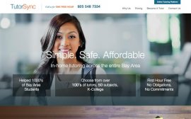 A new hero image to show tutors and students in an actual work setting.
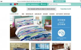
Laural Home's homepage does a great job at making users feel relaxed, providing a light and unintimidating feeling with its choice of colors and font. In addition, users see a variety of sale-related CTAs, including 40% off dorm room items and free shipping on orders over . To make sure users know that Laural has new products in stock, the site also features a “20% on New Sizes” image-based CTA.
Testing an end date on the “40% off dorm sale” to drive urgency.
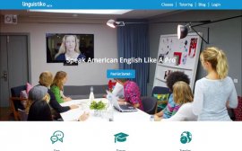
Maybe it’s just our experience, but this image perfectly captures a situation at the office when language barriers can arise. It portrays an international conference call with people in the office speaking one language and the person on the other end of the call speaking another. It’s one of those things that’s hard for both sides, often leaving people saying “I need to improve my English, Spanish, German ... etc.”
Include a statistic in the headline about the professional benefits of learning a new language or the rise of people learning a second language for business.
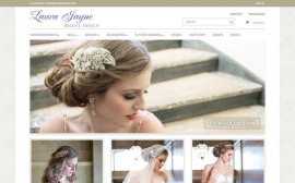
This site is laser-focused on one thing: bridal design. In the wedding industry, making a bride feel like she has the spotlight on her is essential to developing relationships that turn into sales, and this site definitely showcases that laser focus on the bride. In addition to bride-focused imagery, visitors have both primary and secondary CTA options available to them as they can view collections or contact the company via phone or form.
Different copy on the hero image CTA that invites the visitor to shop for that specific hair accessory or view how it fits into a specific outfit.
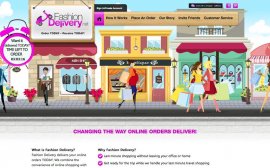
While we don’t love being different just for the sake of being different, this site is different for the right reasons. By using a cartoon-based theme design, Fashion Delivery is creating its own private world that visitors enter into when arriving on the site. It works because the service - same-day clothing delivery - also seems like a fantasy. We also love the expiring clock letting visitors know that they still have time to order, but there is an expiration.
A phone number above the fold to answer last-minute questions about orders. The company may not be staffed to handle such an increase in call volume, but it would be a good test to run to see if the revenue generated would be worth an increase in hiring.
YOU MIGHT ALSO LIKE
Share this Post
latest post
-
-
 Web Page Designer Definition September 29, 2018
 -
-
 What is the best Web design software? September 23, 2018
 -
 Best Web design colors September 20, 2018
 -
 Online Responsive Web design September 17, 2018
 -
 Web Page design Perth September 14, 2018
 -
 Best PC for Web design September 11, 2018
 -
 Best Practices for Web design September 8, 2018