
 Today we're going to learn the importance of color in Web Design and how to choose a pleasing color scheme. This article is part of our Basix series, which is aimed at providing practical and concise explanations of design principles for those with little design experience.
Now, let's begin this tutorial.
Who this Article is Written for:
This article is written for people that are just starting to learn formal design principles. It is not meant to be a comprehensive study of how to apply color to a design (we'll have plenty of those in the future), but rather, it's an overview for those looking for practical advice that will help them approach color theory within the context of a web design project.
I'm writing this because I've always found it difficult to decide on a color scheme that works well for a project; it's probably one of the toughest decisions that I have to make as a designer. However, by learning the basics of Color Theory and some excellent tools available on the web, I've been able to strengthen my designs and account for this weakness.
A Few Candidates for the Target Audience:
- A programmer looking for advice to help them create a visually appealing prototype.
- An aspiring designer who wants a brief overview of the subject
- Someone who doesn't understand the difference between Web Development and Web Design.
In A Nutshell, What is Color Theory?
Color Theory actually covers a number of things, but at the most basic level it is the interaction of colors in a design through complementation, contrast, and vibrancy.
The interaction of colors in a design through complementation, contrast, and vibrancy.
While the first part of this definition is straightforward (and admittedly bland), it is the last 3 terms which define the basic Color Theory:
Complementation
Complementation refers to the way we see colors in terms of their relationships with other colors. When colors occupy opposite ends of the color spectrum, they lead people to consider a design visually appealing by establishing a happy medium the eye can reside in. Rather than straining to accommodate for a particular area of the color spectrum, the eye is provided a balance. There are two common uses of complementation: the Triadic and Compound color scheme that we will be discussing later. Complementation can take you to new heights of design sophistication when you can begin to master the intricacies of color combinations.
Contrast
Contrast reduces eyestrain and focuses user attention by clearly dividing elements on a page. The most apparent example of contrast is an effective selection of background and text color, as shown below:
If you're ever in doubt, the best practice is usually to choose a very light color for the background, and a very dark color for the text itself. This is one area where color theory is crucial to the usability of a web design; In most projects, large text areas aren't a place to try to be really creative - so keep it simple and legible.
Along with establishing readable text, contrast can also draw the viewer's attention towards specific elements of a page. Think about highlighting a textbook: when you want to draw your attention to a specific portion of the page, you make the surrounding area look different than the rest of the text. The same principle applies to Web Design: Using a variety of contrasting colors can help focus the viewer's attention on specific page elements.
If your website has a dark background, focus on the main content with a lighter color.
This principle also applies to Analogous colors (which we will discuss later):
Vibrancy
Not to sound silly, but vibrancy dictates the emotion of your design. Brighter colors lead the user to feel more energetic as a result of your design, which is particularly effective when you are trying to advertise a product or invoke an emotional response. Darker shades relax the user, allowing their mind to focus on other things. A great example of this is a comparison between CNN and Ars Technica:
CNN's website features a stark red banner across the top, which leads to heightened emotions from users as they are stimulated by the vibrancy of the design (and the contrast between red, white, and black- the primary color scheme of the website).
Ars Technica utilizes a darker color scheme for its background and header to relax the user and focus their attention towards their content. By doing so, their technical and detailed writing is considered the forefront of the site. And more importantly, the user is allowed to transfer the mental energy traditionally reserved for responding to vibrant colors to understanding the article's contents.
How Do I Select an Effective Color Scheme?
Here are 3 of the commonly accepted structures for a good color scheme: triadic, compound, and analogous:
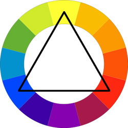
Triadic Color Scheme
Composed of 3 colors on separate ends of the color spectrum. There is a very easy way to create a Triadic color scheme:
- Take a color wheel, and choose your base color.
- Draw an Equilateral Triangle from this point.
- The three points of the triangle will form your tri-color scheme.
By using an Equilateral Triangle, you can ensure the colors have equal vibrancy and compliment each other properly.
Compound Color Scheme (aka Split Complimentary)
The Compound color scheme is based on providing a range of Complementary Colors: two colors are chosen from opposite ends of the color spectrum. By doing so, the designer is allowed more freedom in their design while also benefiting from the visual appeal of complementary colors.
Analogous
An Analogous color scheme is based on a careful selection of colors in the same area of the color spectrum. Usually the colors are differentiated by their vibrancy, and their contrast when compared to each other.
Two examples of an Analogous color scheme are:
- Shades Yellow and Orange
- A Monochromatic Selection (Shades of a base color)
Just the Beginning...
The beauty of where we are in history right now is that we can benefit from centuries of scientific and artistic color theorists. There are entire volumes that have been written about the minutia of color theory, so I'll encourage those of you who really want to dig deep into the subject to find one of the numerous academic books available to harness some of the deeper concepts. We'll also be releasing deeper articles on "color theory for web designers" in the future here on Webdesigntuts+ :).
Now let's look at some great tools that you can use to experiment on your own:
Ways to Make Your Life Easier
Thankfully, there are a few tools at our disposal that make color selection extremely easy when utilized properly. And best of all, they will further our understanding of Color Theory.
YOU MIGHT ALSO LIKE


Share this Post
latest post
-
-
 Web Page Designer Definition September 29, 2018
 -
-
 What is the best Web design software? September 23, 2018
 -
 Best Web design colors September 20, 2018
 -
 Online Responsive Web design September 17, 2018
 -
 Web Page design Perth September 14, 2018
 -
 Best PC for Web design September 11, 2018
 -
 Best Practices for Web design September 8, 2018