2. Animated forms
Sometimes, a unique form design isn’t so much about how it looks, but how it’s presented. The age of stuffing your form at the bottom of your website is over. Now, with unique web interactions, you can animate your form in fun and interesting ways, and let people access it from anywhere on the page.
Slide in from the bottom or side
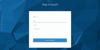
This Webflow template lets people open the contact form at any time, without negatively impacting the overall design. By sticking a Contact button to the bottom of the page, you can let people get in touch whenever they’re ready.
You can also let people access your form through a slide-out menu. Instead of whisking your users away to a contact page, bring the form to them by sliding it in from the side of the screen.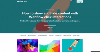 This is a great pattern for situations where someone might want to reference content on the page while they’re reaching out.
Full-screen form
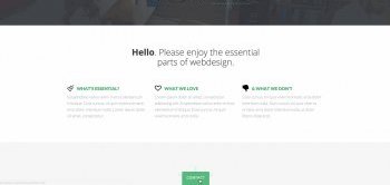
A great way to bring focus to your form is by eliminating distractions. Instead of packing your form into an already-busy part of your site (like the footer), try adding an interaction to make it full-screen (like we do with our Subscribe button here on the blog).
This helps your user enter the info you want in a clear and focused way, so it’s easier for them to finish up.
We use a full-screen subscription form right here on our blog (hint, hint).3. Natural-language forms
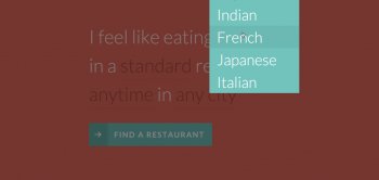
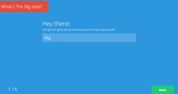 A great trend I’ve seen lately are forms that rely on natural language use. In the example below, filling out the form feels more like doing a Mad Libs than something you’d find on a contact page. Designing your form this way creates a conversational context, easing understanding without leaning on the traditional form label plus input box pattern.
Not only does it feel original and well-designed, but also more natural.
4. Step-by-step (procedural) form design
Sometimes the best way to fill out a form is one step at a time. By letting people add information in easy-to-understand pieces, you’re encouraging forward momentum and delivering a more focused experience than simply displaying all the fields at once.
 The example below uses both a natural language form and step-by-step process to guide people in entering information. This is a great option for situations where a person’s answers impact upcoming questions. As you can see in the Oscar Health Insurance form, answering “me and my spouse” triggers an opportunity for the user to give the spouse’s age.
Sometimes, a simple step-by-step process is enough. But sometimes, you’ll want to show how many steps it takes to complete the form, so a user doesn’t feel lost in the process itself. Here are two examples of unique forms that do this very well.
What’d we miss?
Get our top web design content in your inbox
Just like over 300, 000 other designers.
YOU MIGHT ALSO LIKE


Share this Post
latest post
-
-
 Web Page Designer Definition September 29, 2018
 -
-
 What is the best Web design software? September 23, 2018
 -
 Best Web design colors September 20, 2018
 -
 Online Responsive Web design September 17, 2018
 -
 Web Page design Perth September 14, 2018
 -
 Best PC for Web design September 11, 2018
 -
 Best Practices for Web design September 8, 2018