
Blog
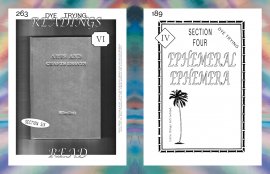
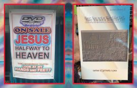
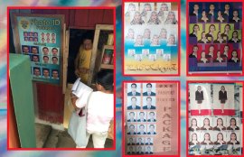
All images courtesy of Clara Lobregat Balaguer
There are few people in this day and age can say that they helped spearhead their entire country's historical graphic design practice. Add Clara Lobregat Balaguer to the list, a Manila-based writer, publisher, graphic designer, and now, cultural historian of sorts, whose latest work focuses on the “precarious history of Filipino graphic design.”
Last Tuesday night in Brooklyn, New York, Balaguer presented her research for her upcoming essay for Triple Canopy entitled, “Tropico Vernacular, ” which is in tangent with her recent book, Filipino Folk Foundry. As she spoke about her findings and the Filipino cultural context she works within, a personal archive of Filipino graphic design flashed behind her. Along the same lines of Molly Woodward’s documentation of urban typography in New York, Balaguer projected a collection of her iPhone photos that document streetstyle typography from hand-painted street signs to political campaign signage to old Filipino book covers.
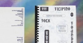
In 2010, Balaguer founded the Office of Culture and Design, a.k.a. OCD, which is a “social practice platform for artists, designers, writers & assorted projects in the developing world, ” then in 2013 her and her partner, Kristian Henson, began Hardworking Goodlooking, the platform’s design studio and publishing arm which her design research book Filipino Folk Foundry was published under.
Balaguer calls her research a “precarious history” of “creative theories” because before her, there was a sparse amount of documents and writings on graphic design in the Philippines. She refers to her findings as creative theories, explaining, “they are creative not because I creative them myself, but because there is no reference to them, so you have to kind of pull ideas out of a hat.”
In the designs in FIlipino Folk Foundry and in slides throughout the talk, Balaguer used a particular typeface called Bradley. Bradley’s aesthetic was something both Henson and Balaguer found represented their heritage, even though the font was originally designed by an American, William H. Bradley, in 1894. They chose this older typeface because it’s close relation to the single stroke that most of the Filipino sign painters use because it is the quickest and easiest to letter.
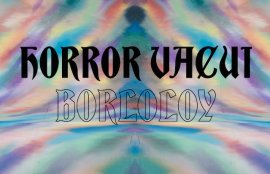
Balaguer saw the expansive vernacular variety of the Philippines as a shortlist of design categories she identifies as: Horror Vaeui Borloloy, Border Mania, Extreme Dropshadow, Maxi Grid Package, Vertical Wordness, and Jejemon Bodots. She uses these visual cues to incorporate into her own work with OCD, realizing them in poster design and book covers.
Keep your eye out for Clara Lobregat Balaguer’s "Triple Canopy" essay, coming soon, and stay updated with her work with the Office of Culture and Design here.
YOU MIGHT ALSO LIKE


Share this Post
latest post
-
-
 Web Page Designer Definition September 29, 2018
 -
-
 What is the best Web design software? September 23, 2018
 -
 Best Web design colors September 20, 2018
 -
 Online Responsive Web design September 17, 2018
 -
 Web Page design Perth September 14, 2018
 -
 Best PC for Web design September 11, 2018
 -
 Best Practices for Web design September 8, 2018