 Web design can be tough for a lot of reasons. But the biggest challenge is probably that there are so many ways to approach a problem. Many websites set a bad example for beginners. Even big brands known for quality can often mess up. I could list a lot of things, but here are the top web design mistakes I see over and over again that need to stop.
Modals and Pop-Ups
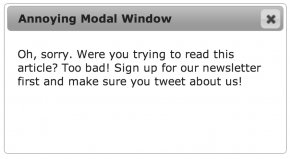
You’ve seen this before. You click on a link to a news article or a blog post, and a gigantic modal pop-up window covers the content. This makes absolutely no sense. If you’re requesting a specific article, obviously that’s why you’re visiting the site.
Let them read and enjoy the experience you’re offering. No need to spoil the purity of their intent by redirecting them someplace else. If the visitor likes the site or they’re interested in the advertisements, they’ll click around and explore on their own. Modal windows aren’t bad by themselves, but putting it up as the very first thing that people see is lazy and desperate.
EXCEPTIONS AND ALTERNATIVES
Despite their potential for abuse, modal windows are useful in many scenarios where leaving the current page may not be the best option. For example, if your website has a contact button, it might not merit leaving the current page. Presenting a modal window with a simple contact form allows for the site visitor to fill it out and then return to the current task.
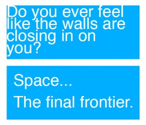
 Walls of Text
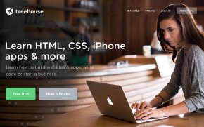
Web design is a wonderful medium that allows you to combine text, images, and other multimedia into an interactive experience. To that end, it’s not a good idea to turn a website into something that it’s not, like a tri-fold brochure or an information pamphlet. If you’re marketing yourself or a business, don’t present the site visitor with a huge wall of text on the first page. Instead, make the home page something very simple that explains exactly what the site is about. If they want to know more, they’ll dig in. Treehouse is a good example of using a simple explanation:
A giant block of text is not only intimidating, it’s also not always pretty to look at. Text is an important part of web design, and when abstracted as a visual element (rather than something that’s meant to be read) it can add a lot of rough “texture” to the page. When you’re trying to invite people inside a website to learn more, this can add a lot of undesirable visual friction.
If you’re tempted to put a lot of text on a page, first try to cut it down and summarize portions. Then, break up each major idea into its own section, possibly including some pictures or illustrations. The page at is a good example. There’s lots of text on the page, but it’s presented in small chunks.
Not Enough Space
 Every beginner web designer and developer has done this one (myself included). They feel compelled to fill the page with interesting information and stuff for people to look at and click on. Poor use of space around the elements just compounds the problem and the result is a cluttered mess with no clear purpose.
Humans crave simplicity, and it can be easier for you to provide that to them by presenting just a few things at a time as they become relevant. The web facilitates this through a number of mechanisms, but practically speaking, you should always make sure each piece of information is appropriately grouped with other related design elements and that there’s enough separation between each group.
It can be hard to know when to use space if you’re just starting. Instead of inventing all the aesthetics yourself, I recommend you try a front-end framework like or . The grid and typography frameworks contained within will help you space your elements appropriately.
Thinking Too Far Outside the Box
Every new web design project is filled with limitless possibilities, so it can be tempting to try things that have never been done before. Innovation is important, but too much can sometimes be a bad thing. You want to create experiences that feel familiar to site visitors so they can explore your site right away with no learning curve. Getting the basics right is difficult enough, so if you haven’t made too many websites yet, it’s a good idea to embrace common design patterns. Simplicity can be just as exciting as innovation if it’s done well.
Even if you’re not very experienced, you can certainly experiment in the right context. It’s rarely a good idea to take a big risk on a big client project, but if you’ve executed something well already in a side project, then using it in production is the next step. Continuously building side projects and exploring new approaches will help evolve your professional work.
Mysterious and Complex Navigation
Navigation is probably one of the most difficult aspects of web design. In all my projects, I’ve spent quite a lot of time thinking about how all the screens flow together, how everything is labeled, what should be on its own page and what can be combined, and so on. If there’s any single word that can make a huge impact on your site’s usability, it’s probably something in the navigation.
Massive sites like Wikipedia or Facebook have millions of pages, but they all flow together in a stream of consciousness without overwhelming visitors. It seems effortless because they do such a great job. But if you’re just starting out, try to make projects with just a few pages. Be clear and explicit about what each page contains, then label it accordingly in your navigation. Mixing intentions makes things feel confusing.
YOU MIGHT ALSO LIKE

Share this Post
latest post
-
-
 Web Page Designer Definition September 29, 2018
 -
-
 What is the best Web design software? September 23, 2018
 -
 Best Web design colors September 20, 2018
 -
 Online Responsive Web design September 17, 2018
 -
 Web Page design Perth September 14, 2018
 -
 Best PC for Web design September 11, 2018
 -
 Best Practices for Web design September 8, 2018