 If you have a physical store or office, it doesn’t matter how big or small, how posh or shabby it is, you always have people available to guide and assist customers.
This is not the case for a website; on a website the home page is like the main entrance. Without people to guide you to where you want to be there are certain website design aspects that take on this role, ideally in the most efficient and time-saving manner.
There are three main reasons a website’s home page design needs the utmost attention to detail:
- Most Popular Page: Most other sites will link to your home page by default and it will appear most often in SERPs, as compared to inner pages.
- Most Socially Shared: The home page link can easily be shared as it is the shortest URL.
- Domain Popularity: Domain popularity is established by the number of links built to a website, its conversion rate, its usability and its various SEO elements. Domain popularity plays a major role in the positioning of your content (ideally highly) in Google SERPs, as discovered in our recent Google SERPs Analysis.
 1. Home Page Colors
- The colors on various elements of the home page should highlight certain areas more than others. The goal is to direct the eye toward the section of the website that will lead to conversions.
- The colors in the logo, main menu, title, call-to-action (CTA) and supporting text or images must coordinate with one another to create a pleasing aesthetic on the page.
- Do not use too much color on a page, and stick to three to four main shades for the home page. Make sure one of these colors is black or white. Exceptions to this could include websites that deal with kids, lifestyle and fashion, home decor or entertainment.
Example 1:
What’s wrong with the example?
- Too many colors! When this many colors are used it’s impossible to highlight information – your eye has no place to rest.
- The design is messy and does not look professional. This will put off anyone who lands on this page with the intention of buying something.
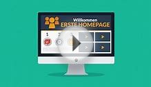
 Example 2:
What’s good about this example?
- Three colors- yellow, black and white, are used in a fantastic manner that is attractive to a new site visitor and engages them with prominent-yet-tasteful text colors.
2. Home Page Banners:
Rotating flash banners should generally be avoided as they provide a poor user-experience. As a website designer or owner you might find it easy to read and understand multiple banners or a rotating banner but you have seen the content a thousand times. For new visitors flashy banners create poor readability, thus increasing bounce rates.
Depending on the theme of your website you may be able to avoid a home page banner altogether, but if not, stick to a static banner. Also, use a color that contrasts with the rest of the page and is wide enough to hold the prominent message of your site in both text and image. It should also be able to highlight your call-to-action button.
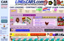
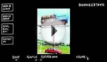
 Example 3:
What’s wrong with this example?
- The image has nothing to do with the nature of the business, i.e. SEO.
- The text holds little value for the site visitor.
- There is no call-to-action.
- Besides the banner, the bottom-right corner image does not load properly.
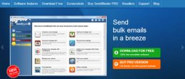
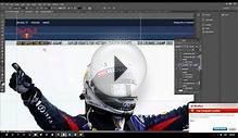
Example 4:
- It has a prominent screenshot of the product, in this case an email marketing software.
- Although this was a rotating banner, the text was minimal, the screenshots were big and the call-to-action buttons were placed in the same position on all the banners. For these reasons the banner did not poorly affect the website’s usability.
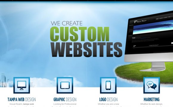
3. Home Page Title and Supporting Text:
The title text on the home page describes the content of the website in a few words. It can also describe the kind of customers your business caters to or the benefits of the products and services offered. Do not confuse this with the Meta title of a home page – what we’re talking about here is the text and/or image placed prominently on the site as a message about what you have to offer to site visitors.
The factors to consider in your home page title text are as follows:
- Does it sound like an advertisement jingle? (It should not!)
- Does the message contribute to conversions, ie., is it user-oriented?
Sometimes you cannot explain your message completely in the title. In such cases you need supporting text.


YOU MIGHT ALSO LIKE
Share this Post
latest post
-
-
 Web Page Designer Definition September 29, 2018
 -
-
 What is the best Web design software? September 23, 2018
 -
 Best Web design colors September 20, 2018
 -
 Online Responsive Web design September 17, 2018
 -
 Web Page design Perth September 14, 2018
 -
 Best PC for Web design September 11, 2018
 -
 Best Practices for Web design September 8, 2018