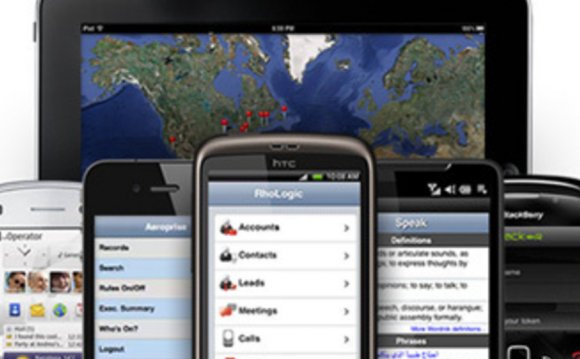
Static navigation menu
This technique uses the WebKit localStorage paired with the off-canvas system Mobify developed in-house, called Pikabu. There are a bunch of off-canvas libraries available, you can also check out David Bushell's Responsive Off-Canvas Menu, and Christopher Yee's Pushy.
3. Pinch to Zoom in Galleries
Pinching to zoom text is generally regarded as the sign of poorly formatted content — but images are a different case entirely.
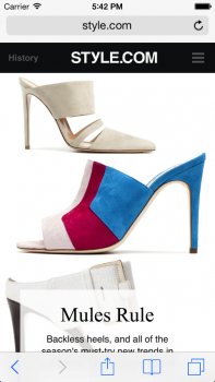
Just like with native maps and images in apps, users frequently want to zoom into pictures on the web to see more detail.
Style.com has progressively enhanced their many image galleries so that users can zoom into any slide and view the image in finer detail. However, they’ve done so in a way that does not zoom into the viewport — just the container that the image is in.
 Since this feature requires a fair amount of processing power, it has only been enabled for users with Retina iOS smartphones. Remember, it's important to treat performance as a design feature, so make sure that complex features are only turned on for devices that can support them in a performant way!
At Mobify, we use a device's pixel density (among other factors) to estimate how powerful the device is. This allows us to ensure that we provide an experience that works wonderfully on devices that can handle it — without worrying about breaking the experience on older devices.
4. Huge Image Carousels
There are two main reasons why large image carousels are a pain to implement on mobile: performance and navigation.
But if you overcome both of these challenges, you can create a very native-feeling image browsing experience to really take advantage of all those wonderful high DPI screens out there.
 Challenge #1: Performance
The first challenge is a performance one: devices are not usually powerful enough to render many objects in a row.
Imagine an image that is as big as a device’s screen (or twice as big if it’s a Retina device). Now, since it’s an image carousel, imagine a few dozen or even hundreds of those kind of images next to each other in a row. How wide will it be?
On Style.com, one particular image carousel came in at more than 80, 000px wide. Yikes.
Most mobile browsers crash just trying to render that many elements on page — even if they are just empty placeholders with no media content.
To get around this, Style.com has optimized image carousels so that inactive slides take no space on the page. Using the DOM rewriting properties of Mobify.js, images are requested on-demand only, and thus the amount of CPU resources required for their rendering is significantly lower.
 In some cases this made the mobile gallery up to 10x smaller (from 6.2MB down to 650kB on one page).
Challenge #2: Navigation
The second challenge was around navigation. If you have all of these beautiful images in a long row, how can you quickly move between them?
The answer lay in creating a grid view from the carousel HTML. This can be done relatively easily by changing the image sources and CSS.
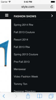
5. Native-Like Alphabetical Lists
An alphabetical index is a great way to help users scroll through long lists of items. Apple provides one to help users select contacts and music in iOS, but it’s proven to be pretty difficult to bring this functionality to the web in a way that works as well as its native counterparts.
Conclusion
Until recently, the difference between browsing the web and using a native app has been clear to anyone who uses a smartphone.


YOU MIGHT ALSO LIKE
![Why SHOULD You Design For Mobile Web? [Quick Read]](/img/video/why_should_you_design_for_mobile.jpg)


Share this Post
latest post
-
-
 Web Page Designer Definition September 29, 2018
 -
-
 What is the best Web design software? September 23, 2018
 -
 Best Web design colors September 20, 2018
 -
 Online Responsive Web design September 17, 2018
 -
 Web Page design Perth September 14, 2018
 -
 Best PC for Web design September 11, 2018
 -
 Best Practices for Web design September 8, 2018