 Smartphone and tablet adoption rapidly increases, so does the importance of mobile-friendly websites. Smartphones and tablets have changed the approach toward design and user experience. Before the spread of mobile devices with advanced web-browsing capability, web designers had only one primary challenge to deal with keeping the same look and feel of their websites. However, interacting with websites on smartphones and tablets is not the same as doing that on a desktop computer monitors. Factors such as Click versus Touch, Screen-size, Pixel-resolution, support for Adobe’s Flash technology, optimized markup and many more have become crucial while creating websites with Responsive Design.
 If SEO is a core component of your digital marketing strategy, having a mobile–friendly website is becoming essential. Mobile sales have already overtaken desktop sales, and mobile Internet usage is predicted to overtake desktop internet usage by 2014. It is only logical that mobile search will overtake desktop search at some point in the near future as well.
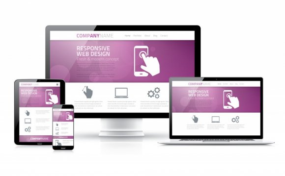
What is Responsive Web Design?
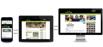
 Responsive Web Design (RWD) is an approach of laying-out and coding a website such that the website provides an optimal viewing experience — ease of reading and navigation with a minimum of resizing, panning, and scrolling — across a wide range of devices (from desktop computer monitors to mobile phones).
The designer creating a Responsive Design should ensure that the website’s navigation elements, screen-layouts, text, images, audio/video players and other UI elements re-adjust themselves on a variety of devices. Thus, one need not spend extra time and money in creating and maintaining one “mobile-site version” and another “desktop-site version” of her website.
Now, having understood what is Responsive Web Design, let us Check the advantages and why Responsive Design is important while creating websites.
1. Super Flexible
Responsive web design sites are fluid, meaning the content moves freely across all screen resolutions and all devices. Both the grids and the images are fluid. Just as a liquid spreads out or draws in to allow its content to fill an allotted space and retain its appearance, responsive web design’s fluidity achieves the same result with website content on a device screen.
2. Excellent User Experience
While, content is king and discover ability of content are foremost success metrics, it is the user experience that enables visitors to consume content on any website through the device of their choice and preference, anytime. Thus, responsive web design is about providing the optimal user experience irrespective of whether they use a desktop computer, a smartphone, a tablet or a smart-TV. Responsive web design accommodates the busy professional during the day and the wide-awake college student needing access to your site anytime. No scrolling or resizing is needed for any visitor to access your website from their favorite device.
YOU MIGHT ALSO LIKE


Share this Post
latest post
-
-
 Web Page Designer Definition September 29, 2018
 -
-
 What is the best Web design software? September 23, 2018
 -
 Best Web design colors September 20, 2018
 -
 Online Responsive Web design September 17, 2018
 -
 Web Page design Perth September 14, 2018
 -
 Best PC for Web design September 11, 2018
 -
 Best Practices for Web design September 8, 2018