
 The default approach used by many designers when designing for a mobile device is still to scale down their (desktop) website and make it responsive. This approach is a poor strategy for mobile design. Rather than just scaling down a site, you need to examine your client's business and asses the importance of mobile access for their particular business.
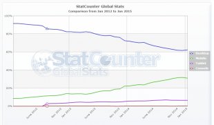
If your client’s customers are primarily desktop/laptop users – for example, enterprise level access to a tool that will only be accessed from workstations – then you don’t need to bother about mobile access. But if your client wants an online store or provides localized information depending on where customers are – then you’re better off using a mobile first design approach. To reach the largest number of people and grow your (client’s) business, your website needs to work well when accessed from a range of devices. So take the effort to first sketch out your mobile web strategy.
In the interest of a better, more intuitive and user friendly mobile experience, let’s take a closer look at some of the best practices to keep in mind for mobile designs:
1. Have Clear, Focused Content
Many people use their mobile device on the go – in a hurried, rushed state. Combined with small touch screens, it doesn’t make for easy search or navigation. While designing for a mobile experience, minimalism rules. Keep clutter to a minimum. Each page including the homepage should have just one central focus. If you have any atypical gestures, like a swipe to move to the next page or a horizontal scroll, don’t assume users will pick up on these. Make it easy for users. Tell them how to use these features with a small arrow or a hovering message, whatever it takes to make it easy for them to find what they’re looking for. Mobile users notice and appreciate, the small things that make their experience smoother. And of course, it works better for you too.
 2. Menus and Navigation: Keep It Simple
Traditional desktop websites display a prominent menu bar at the top of the page. On a mobile this eats up precious screen space. To resolve this, make the menu a drop down accordion or icon on the top left or right of the mobile screen.
Another desktop habit that doesn’t work well on mobiles is multi level menus with sub menus that show on hover. On a mobile device, you want to keep things accessible. If the user has to tap through 4 levels of menus to find something, chances are high they’ll leave after the 2nd tap. Avoid multi level menus on mobile sites as much as possible. This is a stark contrast to desktop design where people worked hard to get almost every bit of information on the website even if it meant 3 levels navigation menus and 10 widgets crowding the sidebar. There's a premium attached to screen space on mobile devices. Keep it minimal and focus on the key message you want the user to take away. In fact, that’s a good practice to follow even for desktop sites.
3. Create Fluid Layouts
Many mobile devices means many different dimensions. However tempting it may be, don’t just design for a 320 pixel width. Like it or not – 176, 240, 320, 360, ~480-600 (landscape) are also common device widths. Keeping your layout flexible and fluid ensures it displays properly on different screen sizes. You don’t want the site to work just on devices that match your fixed break points but look weird on everything else. Here’s a primer to fluid layouts and one on getting fluid layouts working in responsive designs.
4. Design for Touch
Gone are the good old days when we only used keyboard and mouse events to interact with a website. On mobile devices, the primary mode of interaction is usually touch. Designing for touch requires a level of care not needed in the desktop world. Instead of a precise cursor, you now have to account for fingers of all shapes and sizes applying varying kinds of pressure to touch screens that respond differently. You need to make sure forms, buttons and other elements that require a touch input or gesture are large enough to avoid overlap with adjacent elements or misinterpretation of the touch event.
YOU MIGHT ALSO LIKE


Share this Post
latest post
-
-
 Web Page Designer Definition September 29, 2018
 -
-
 What is the best Web design software? September 23, 2018
 -
 Best Web design colors September 20, 2018
 -
 Online Responsive Web design September 17, 2018
 -
 Web Page design Perth September 14, 2018
 -
 Best PC for Web design September 11, 2018
 -
 Best Practices for Web design September 8, 2018