
Summary: Reasonably big monitors have finally become the most common class of desktop computer screen, dethroning the 1024x768 resolution that was long the target for web design.
The change over from 1024×768 to bigger screens actually occurred in 2009, but there were so many different larger-resolution sizes — including many widescreen monitors — that 1024×768 held its position as the single-most popular resolution until this year.
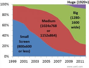
The following chart shows the evolution in computer screen sizes from 1999 to 2012 averaged across as many sources as I could find for each year. (Averaging reduces the influence of bad data in any one statistic.) This is for desktop and laptop computers; not mobile devices.
Implications of Bigger Monitors
The chart makes several things clear:
- Changes in screen sizes happen very slowly. Once people own a monitor, they don't upgrade it for years, even if they do get a new PC. This is particularly true in corporate settings, despite the productivity benefits from giving all high-paid staff members a 30-inch monitor (or bigger, if available).
- Small screens are finally so rare for desktop computers that we don't have to design for them. But now even smaller mobile screens have become popular enough that we have to consider small screens anyway :-(
- Big screens are now the most common class of desktop monitor (1280–1600 pixels wide). I call these screens "big" only in comparison with those that went before; in reality, even the size labeled "huge" in the chart is still too small for maximum knowledge worker productivity.
- In usability studies, the cardinal rule is always to test on the equipment used by the most customers. So, you should now run most of your studies with "big" monitors. You should also run a few sessions on "medium" and "huge" monitors to make sure that your design remains usable for people with different screen sizes. (For more info, see our full-day training class on User Testing.)
- For web design, I've always recommended avoiding "frozen" designs and instead ensuring that your design can scale across a range of screen resolutions (especially since the really important number is the browser canvas resolution, which is often smaller than full screen, particularly on huge monitors).
- Still, you must target something as the best case, where the design looks its finest (while still working on bigger and smaller screens). Since 2010, the core design target has been the big screen. For a few years, it will be safest to target screens in the lower range of the "big" category.
The old recommendation was to make your website look its best at 1024×768. The new guideline is to optimize for widescreen monitors around 1440 pixels wide.
YOU MIGHT ALSO LIKE


Share this Post
latest post
-
-
 Web Page Designer Definition September 29, 2018
 -
-
 What is the best Web design software? September 23, 2018
 -
 Best Web design colors September 20, 2018
 -
 Online Responsive Web design September 17, 2018
 -
 Web Page design Perth September 14, 2018
 -
 Best PC for Web design September 11, 2018
 -
 Best Practices for Web design September 8, 2018