
 In this article, we'll dissect two approaches to creating responsive web design menus; the slide down and the slide in. We'll look at the HTML, CSS, and jQuery to make these mobile friendly menus function.
Responsive web design has become standard practice on the Internet. If your website isn’t responsive, you’re alienating an estimated 60% of web users. One of the biggest hurdles with responsive web design is crafting navigation systems that function just as well on small screens as they do on larger screens.
In this article we’ll look at two approaches to creating a mobile version of a menu featuring the slide down and the slide in. I’ll break down the actual HTML, CSS, and jQuery that make these menus work. The two examples both use the hamburger icon menu style which has emerged as a common accepted practice on the web to represent a collapsed or hidden menu.
I encourage you to use these techniques as the final resort when the screen size becomes too small to accommodate a traditional menu. I usually resize and reposition the menu from desktop sizes to tablet sizes and only generally resort to a collapsed menu below 767 pixels wide, which is the general max size of a landscape mobile device.
Disclaimer: Just like my last responsive web design example article, it’s going to get pretty nerdy from here on out.
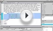
The slide down menu is my preferred method when a website has eight or fewer menu options (any more than that and this technique becomes cumbersome). Here’s the basic HTML structure to set everything up.
See the Pen xbxvVP by Alex Caldwell (@ACaldy) on CodePen.
Here’s the CSS to set it up as a traditional horizontal menu as well as a collapsed menu with a hamburger icon. You’ll notice that the CSS is written in Sass. The heavy lifting happens in the media query at 767px.
So at a screen width of 767px we show the .menuIcon class where the menu used to be. We also hide the menu with the combination of max-height:0; and overflow:hidden; Then we go through and style everything inside of the menu. The menu options stack with display:block; and span the full width of the page. We also prep the menu with a CSS transition when the max-height is changed with a Sass mixin.
 Finally here’s the jQuery function that toggles the class .menuOpen:
The slide in is a good technique when the site has a large list of menu options (generally eight or more). Just like the slide down menu, this menu collapses into a hamburger menu icon and then takes the screen over by sliding from the side and pushing the body of the website over. It is a good technique for directing the users attention as it becomes the only thing that they can interact with on the screen.
The actual technique is largely the same. There’s a media query to alter the CSS and a jQuery toggle function to add and remove a couple of classes. It’s the initial HTML structure that differs for this technique as the mobile menu must be positioned outside of the main website container in order to push it to the side. The HTML structure would look something like this:
See the Pen ZYYQwX by Alex Caldwell (@ACaldy) on CodePen.
Note that I’d normally use a php include for the menu options so that if we update it we only have to change it in one spot, but I can’t do that with codepen. There’s also a .mobileDimmer class that we’ll use to fade the body of the website to shift all of the focus to the menu.
The initial CSS to set up .menu and hide .mobileMenu looks like this:
So there are a couple things happening here. We’re laying out .menu in a horizontal layout. We’re setting up the .mobileMenu to stack the menu options vertically and then hiding it with position:absolute, margin-left:-100%, and display:none. We’re also setting up .mobileDimmer to fill the body of the site with a 50% black background and a left positioning value of 50% (the width of the .mobileMenu).
Under 767px width, we hide .menu and show .menuIcon. We also get .mobileBodyWrapper and .mobileMenu prepped with the class of .menuOpen for the jQuery toggle function. When we add the .menuOpen class to .mobileBodyWrapper, it will slide the entire body over 50%, make it position:fixed and hide everything outside of the viewport with overflow:hidden. When we add the .menuOpen class to .mobileMenu, it will change to display:block, margin-left:0, a width of 50%, and overflow-y:scroll. The .mobileDimmer we set up earlier will cover the body and we’ll have a nice focus on the menu on the left as we dim the body on the right.
Note that it’s set up in a jQuery function so that if the user clicks on the .mobileDimmer it will also close the .mobileMenu, which is good usability. It’s a nice little effect where the focus is put on the menu as the user interacts with it.
Hopefully this article sheds some light on how to handle two different menu sizes in a user friendly manner. Creating a menu system that works on both desktop and mobile is challenging.
YOU MIGHT ALSO LIKE

Share this Post
latest post
-
-
 Web Page Designer Definition September 29, 2018
 -
-
 What is the best Web design software? September 23, 2018
 -
 Best Web design colors September 20, 2018
 -
 Online Responsive Web design September 17, 2018
 -
 Web Page design Perth September 14, 2018
 -
 Best PC for Web design September 11, 2018
 -
 Best Practices for Web design September 8, 2018