
 Last updated: by
Have you been outside lately? You know how you are seeing more people using tablets and smartphones? Well, it’s not a trend as much as the norm any more. Walking around, we are plugged in to our mobile device. At some restaurants, the waiter or waitress takes our order. Mobile is ubiquitous. So why, why, why are there still so many businesses that have not yet adapted? I don’t know, and the good news is that you have a way to take advantage of the new reality.
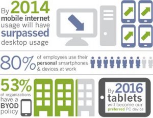
As smartphones and tablets are ever more capable of performing tasks that used to be only capable on desktop, one thing is crystal clear: Internet surfing, connecting on social media, checking emails and online shopping is being taken over by mobile.
Naturally, because mobile Internet usage is steadily increasing, you can see that it’s extremely important that your website is mobile friendly. In the past, you had a website designed for desktop users and another site specifically developed for mobile users. But, now we need a website optimized for desktop, tablet and, mobile. Are you really gonna build multiple unique sites to accommodate the various screen sizes?
There actually is a method to satisfy many types of users. It’s called responsive web design. According to a report by Morgan Stanley, Mobile Devices will overtake Desktop usage this year. 2013 may have been hailed as “The Year of Responsive Design”, but RWD is far from last year’s news. Put simply, having responsive design means a website adjusts depending on which device they are being displayed on, ensuring that whether the content is viewed on a phone, tablet, or desktop computer, the website will remain user-friendly, which is ultimately the most important feature of any website or blog. So as though you really needed them, here are the Top 12 Reasons to convert to Responsive Web Design.
1. Recommended By Google
Since Google is the primary search engine to impress with your website, it is smart to follow what Google loves. Google not only recommends Responsive Web Design (RWD) as the best way to target mobile and tablet users, and also favors mobile-optimized sites when presenting results for searches made on a mobile device. This is especially true when mobile users search for local services. It’s important to note more searches are originated on mobile devices.
Of course there is still debate whether a separate mobile website or a single, responsive site is the best route to take. From an SEO perspective, a single site is the better option (More on this later). Separate mobile websites have their own URL and different code, whereas responsive sites use one URL and one set of pages and files, making it simpler for Google more efficient for Google to crawl, index, and organize content and avoids issues of duplicate content.
When you think about it, it’s also easier and less confusing for users to share, interact with, and link to than content on a stripped down mobile site.
For instance, a mobile user who shares content from a mobile site with a friend on the Facebook app who then accesses that content using a desktop, which results in that user viewing a stripped down mobile site on their desktop. This creates a less than optimal user-experience, and because of the large emphasis Google is now placing on user-experience as a ranking factor, this is essential to take into account with regards to SEO.
2. One Website, Multiple Devices
Providing a great user-experience across multiple devices and screen sizes is the most appealing and most critical aspects of responsive web design for today’s uber mobile world. Take the following example. I search for a birthday gift on my smartphone during a break at work. I then continue researching this product on the same site on my MAC when I get home.
Because the site is responsive, won’t be frustrated with the extra steps to locate the desktop version of the site, and find the product all over again.
3. Easier to Manage
Having a separate desktop and mobile site requires having separate Google Adwords campaigns, SEO campaigns and separate Google Analytics reports. Managing one site is of course, far easier than managing two sites.
There can be an argument made for multiple sites though, such as having a mobile-specific Adwards and SEO strategy, such as optimizing for keywords that are more likely to be searched when someone is on their smartphone.
4. Positive User Experience Is Key
If a user lands on your mobile website and is frustrated or doesn’t see what they are looking for, according to Google’s Think Insights on Mobile, there’s a 61% chance they will leave and go to a different website. Data shows a positive experience with your responsive website a user is 67% more likely to buy a product or use a service.
5. Blogging and Social Activities Bring Mobile Visitors
If you’re like most smart Inbound Marketers and incorporate blogging and social media in your strategy, you have most likely been seeing increased mobile traffic. A recent study by ComScore cites that 55% of social media consumption happens on a mobile device. SHOCKER!
6. Responsive Design is Preferred for SEO
YOU MIGHT ALSO LIKE


Share this Post
latest post
-
-
 Web Page Designer Definition September 29, 2018
 -
-
 What is the best Web design software? September 23, 2018
 -
 Best Web design colors September 20, 2018
 -
 Online Responsive Web design September 17, 2018
 -
 Web Page design Perth September 14, 2018
 -
 Best PC for Web design September 11, 2018
 -
 Best Practices for Web design September 8, 2018