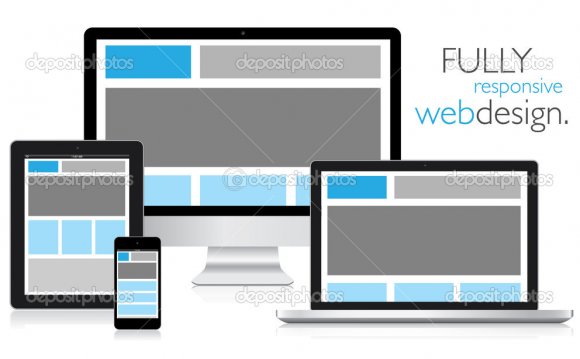
 There is a broad diversity of devices on the market today. Ranging from £30 smartphones to flagship models, there are over 24, 000 Android devices in the wild, and each of these has varying capabilities. They have different screen widths and heights, different aspect ratios, and vastly different experiences.
So how do we cope with this fragmentation? We used to only have to make sure it worked at about 1, 000 pixels wide and call it a day, but not anymore! It may surprise you to find out just how many devices are visiting your website. If you run your own report through analytics software (like Google Analytics) you’ll see the diversity of devices at your doorstep.
Like in many areas of life, to know where you are, you have to look at where you’ve come from. The way the technology has evolved is the reason why mobile devices are being so widely adopted. It also shapes the way we need to approach our UI designs for these devices.
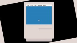
Early home computers were controlled entirely by inputting commands by keyboard. This wasn’t intuitive at all, as you were using a piece of hardware abstracted away from the screen. It was unforgiving as you had to learn a bunch of commands that made sense to a computer scientist, but not the rest of the population. Needless to say, it came with a very steep learning curve so was only tackled by enthusiasts and scientists. Unfortunately, this alienated an entire generation of users who thought they’d never be ‘smart’ enough to be able to use a computer.
But in the ’80s, some clever beans at Xerox created the modern computer mouse. A certain Mr Jobs immediately realised its potential and introduced this new hardware to the masses. It made computers far more accessible, as rather than typing out arcane commands you could navigate visually through your computer.
This led to things we take for granted today, like graphical user interfaces (GUIs). They made use of visual metaphors – wallpaper, desktop, trash – to aid users in understanding what the software did. Also, UI design can provide affordance, i.e. making things look the way they are used, such as with buttons and sliders.
However, for all the great it did, the humble mouse had its drawbacks. It was still an abstract device you had to learn to use, and it wasn’t intuitive. Famously, Andy Warhol took the mouse and waved it in an air trying to draw a circle until Jobs taught him how to use it.
When computers became truly portable, they were first operated with keyboards, then styluses. Styluses are a very natural way to operate a computer – a bit like using a pen. But these were small, fiddly, and could be lost. It required a two-handed operation and your full attention to focus on what was being done, and they had to be synched as they had no Wi-Fi capability.
YOU MIGHT ALSO LIKE


Share this Post
latest post
-
-
 Web Page Designer Definition September 29, 2018
 -
-
 What is the best Web design software? September 23, 2018
 -
 Best Web design colors September 20, 2018
 -
 Online Responsive Web design September 17, 2018
 -
 Web Page design Perth September 14, 2018
 -
 Best PC for Web design September 11, 2018
 -
 Best Practices for Web design September 8, 2018