
Breakpoints
CSS3 media queries create conditional boundaries at which the width of a specific device type’s browser will then trigger alternate styles. Here at Blue Fountain Media, we generally use maximum-width breakpoint, to create a desktop-first (scale down) build versus a minimum-width boundary, for a mobile-first (scale up) build. Queries can also be used to determine height and even device orientation.
Breakpoint sizes (we’ll use widths from here on out) can be set in px or em. The differentiation in modern browsers is negligible, though, compared to a few years back. Breakpoints can be set at any size but they tend to align with the most common dimensions of each Desktop, Tablet Portrait, Mobile Landscape, and Mobile Portrait. Generally speaking, these tend to be 1200/960px, 768px, 480px, and 320px, wide respectively, though industry standards are constantly changing as new devices are released.
Over the years, these types of devices have begun to blend into one another, especially with the introduction of retina displays. As a result, you might find two devices can match the same breakpoint (ie. tablet landscape and laptop) but might also find that a particular device has a unique size, so that’s where the next principle comes into play.
Fluidity
Fluid scaling can be achieved in a few different ways, but it will always involve percentage or em values to permit a container to scale within the bounds of its parent elements, and ultimately the browser. Fluid scaling is necessary to achieve responsiveness between breakpoints, to maximize your real estate, as well as to maintain the flow of columns in a responsive grid.
 A simple example of a fluidly scaling object would be an HTML page consisting of one block with width of 100% and a height of “auto”. As the browser changes width, the block scales with it, proportionally. Where you choose to apply this scaling at the granular level is up to you but fluidity should always exist at the top level of any responsive container.
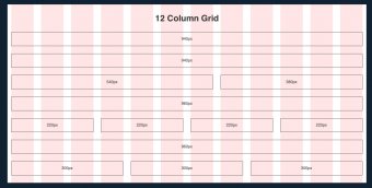
Another popular example of fluidity is a grid layout. In a grid layout, virtual blocks are aligned and evenly distributed over the width of the body of a site or container. These blocks are fixed in width, aligned as inline-blocks, with a parent container which is fluidly scaling. By doing tis, when the browser (and ultimately, the container) reaches the point at which the sum of all blocks exceeds its parent container, the blocks break to the next line. These blocks are referred to as columns and each block could also represent a number of columns.
For instance, if you have 3 blocks, they could represent 9 columns, at 3 columns each. Once you’ve scaled down to a width that fits 2 blocks, at 3 columns each, with the 3rd on the next row, you’re now looking at an 8 column layout, with 2 columns of margin. Scale down further to close out the margin and you’re looking at a 6 column layout with no margin.
Design
Grid layouts may also be used across an entire website, including sidebars and body content. As a result, many websites are designed on grids, flowing from left to right, top to bottom (just like germanic and latin-based written languages).
In order to present the optimally responsive layout for a grid, we start by selecting the known device widths from our knowledge of breakpoints. Using these figures, we calculate the nearest figure of the site width and number of columns, which divide into the greatest number of whole factors. We must do this without compromising the content’s real estate much (so don’t go overboard). One of the most popular systems is the 960grid system, which is often used in 12 columns. Two side-by-side blocks taking up the full width of a page is therefore each 6 and 6 columns respectively, in a 12 column grid.
Photo Credit: Tutsplus.comWhen designing and developing for responsive, we place emphasis on retaining the structure and order of elements from desktop through mobile. This permits fluid scaling while also reducing unnecessary load of duplicate elements that are hidden or shown at specific breakpoints.
Responsive Design at Blue Fountain Media
At Blue Fountain Media, our 2015 standards for responsive design include options for a standard 960 grid, requiring designs for desktop and mobile, as well as a widescreen 1200px or 1280px grid requiring designs for widescreen, tablet or 960, and mobile. All interim stages are either snapped via breakpoints, to the next breakpoint size, or fluidly scaling - the complexity of the design and scope of the project will dictate that decision.
YOU MIGHT ALSO LIKE


Share this Post
latest post
-
-
 Web Page Designer Definition September 29, 2018
 -
-
 What is the best Web design software? September 23, 2018
 -
 Best Web design colors September 20, 2018
 -
 Online Responsive Web design September 17, 2018
 -
 Web Page design Perth September 14, 2018
 -
 Best PC for Web design September 11, 2018
 -
 Best Practices for Web design September 8, 2018