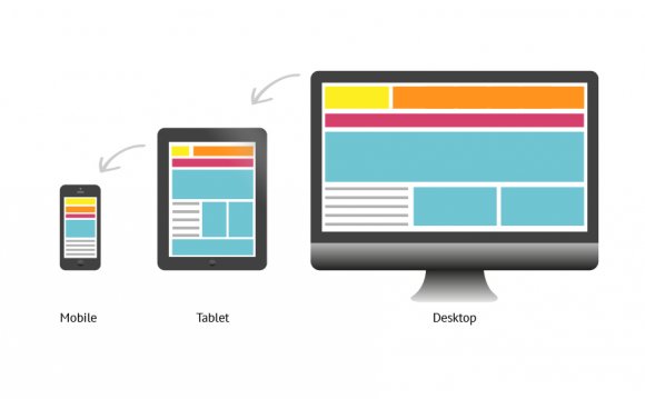
 While some designs are built “in browser” and fully fluid from the start, most designs still start static: you pick a viewport width and height, and sketch or mock up accordingly.
But that begs a few questions: What dimensions do you prioritize with the dev team? What high-fidelity deliverables should you hand off first? Which devices should you consider first for technical constraints?
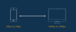
I almost always recommend starting with your user base’s “extremes”—the smallest and largest common device sizes. When in doubt, I’d suggest the following for 2015’s web users:
- 320px by 568px (the iPhone 5 in portrait)
- 1600px by 1000px (an expanded browser on a desktop monitor)
Note: Your audience may differ, so check your analytics to determine your “extremes.”
“Start RWD projects by designing for the smallest and largest common device sizes.”Tackling the small viewport size early forces you to make hard choices about the most important features in your design. The large viewport brings in the opposite considerations: How much content is too much? Are text columns getting too wide, lowering readability? Should select elements get extra white space, and if so, how much to avoid feeling disjointed? Finally, addressing the smallest and largest viewports usually requires that you consider at least a couple input methods—the smallest viewports are often touch-based, while the largest use the mouse and keyboard.
Perhaps most importantly, when you tackle the extremes, you’re tackling 2 sizes at once, not trying to fully flesh out just 1 viewport and retrofit the rest later. That delay alone could trigger clashes between designers and developers down the road.
2. Discuss content layout between breakpoints
With so much design attention given to static wireframes and comps, it’s important to remember that responsive web design is inherently fluid. Which means that a lot of your web audience will experience the design in its “in-between” states. So almost every design has to consider the layout adjustments necessary between the specced sizes. For example, when sizing down, text content may shrink and images drop into a single column.
Avoid making assumptions about what those adjustments can or should be with your development team. Be proactive, and meet with your developers before they get too deep in their work. For especially complex layout changes, it’s a smart idea to create another wireframe or sketch to illustrate. Where specificity is less important, a brief discussion or an email describing the transitions can suffice.
3. Have an image asset strategy early
Image formats and sizes often create stumbling blocks between designers and developers. You might use PNGs, JPGs, icon fonts, or SVGs for smaller elements and icons. There’s no one right answer: everything depends on the content and resources available. But it’s important to agree on one format and stick with it. Also, you’ll likely develop patterns for common image sizes as your web project progresses.
Yet for modern responsive design, that’s just the starting point. You’ll need at least 2 assets for raster formats (JPGs): 1 for normal displays and a second for high-resolution ones. Advanced responsive image techniques call for more assets for different viewport sizes.
Avoid leaving decisions on responsive image formats to the end of a project. At the bare minimum, have a strategy for display density. Read up on srcset and polyfills like Picturefill to ensure good cross-browser support. If it feels overwhelming, start small. Just altering a few image elements with the srcset attribute is a good first step. See how the process goes and grow from there.
 4. Think atomic, modular design
My RWD workflow is influenced by Brad Frost’s thoughts on Atomic Web Design and Jonathan Snook’s SMACSS. Both frameworks rely on small, reusable components as the basis for strong web architecture.
So for developer handoffs, I like to concentrate on small and reusable components first, because they generally present the same UX and visuals across different devices. That consistency can be easier to digest for the development team. Plus, small components tend to be more reusable between pages. So if you design an effective solution, it’s that much easier to re-apply it later on.
Smaller components generally present the same UX and visuals across different devices. That consistency can be easier for the development team to digest.
Imagine you’re designing a signup page with a headline, large graphic, and form. Depending on the device, these elements may shift around or change in size. Early on, focus on the smaller details of the signup form with the dev team. How does it look? What kind of validation do you need? How might the form change for touch input versus mouse and keyboard?
5. Bring in developers for visual and UX feedback
Some designers shield developers from product meetings, usability sessions, and other opportunities for feedback. There’s a kickoff, a handoff, and little else. That’s a mistake.
Remember that experienced developers have a ton of applicable knowledge. They might also have intimate knowledge of the product if they’ve worked with it for awhile.
Front-end developers’ and designers’ skills often overlap. More and more designers write their own code. Developers are boning up on rapid prototyping, wireframing, and aesthetic design. RWD has only exacerbated this trend. A developer can bring strong design insights even without a “designer” title.
Granted, separate roles and responsibilities remain valuable. But small steps toward inclusion can significantly improve the final product. So for your next usability test, bring in a developer to discuss the outcome. Or if you’re running a design brainstorm, maybe invite a few devs.
Collaboration matters
All these techniques need planning and buy-in. With so much attention focused on launching products and hitting deadlines, that can be hard. But good designer-developer relations can bring a lot to any web project—particularly responsive ones. A small investment at the start can have an exponential payoff for your team.
YOU MIGHT ALSO LIKE


Share this Post
latest post
-
-
 Web Page Designer Definition September 29, 2018
 -
-
 What is the best Web design software? September 23, 2018
 -
 Best Web design colors September 20, 2018
 -
 Online Responsive Web design September 17, 2018
 -
 Web Page design Perth September 14, 2018
 -
 Best PC for Web design September 11, 2018
 -
 Best Practices for Web design September 8, 2018