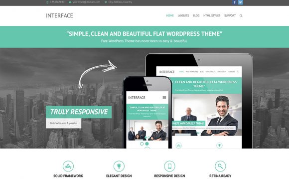
Responsive Web Design has been a big thing in web design and development for the past few years. For the uninitiated, responsive design is a concept aimed at crafting sites that provide an optimal viewing experience regardless of the size of the device and screen. It essentially makes your main website accessible for all, allowing users on smaller devices like mobiles and tablets to get the full browsing experience, from reading to navigation, without the need for feature-lacking mobile-only themes.

Since browsing the web through mobiles and tablets is near ubiquitous nowadays, and any website that wants to stay relevant and meet the needs of a growing, tech-savvy audience should offer a responsive layout. Surprisingly, there are still some popular websites that haven’t moved to a fully-responsive design, but this can only hurt users, and it’s something any aspiring website creator should want to avoid.
Naturally, we ensure that all of our WordPress themes are fully-responsive, but despite the growing popularity of the responsive concept we still receive many queries on our forums on how to disable the responsive features entirely. Personally, I don’t understand such a request; surely you’d want your audience to get the best experience possible for your device? Still, it may be that they or their client have a very specific requirement for their mobile site that requires a separate version of the theme, so it’s not completely unexpected! If you’re looking to disable this feature, you’ll need to be aware of how our themes utilize the various layouts for each device.
There is a slight difference between our old and new themes; previously, our themes used our own GavernWP framework as a base, and offered a theme options panel in the left menu of the WordPress backend to setup theme settings (the last theme with this functionality was University). In our newer themes we’ve abandoned using the GavernWP framework, and instead build the options directly into the Theme Customizer for easier access and real-time previews of changes. In both cases, whether the framework option panel or Theme Customizer depending on your theme, there's a Layout section which allows you to set width options for the theme, including specific options for responsive layout widths.
How it works
When we create the theme, we add CSS rules that create the responsive layout. These are placed in the Theme/css directory, with the rules for each screen size layout defined in its own file called mobile.css, tablet.css small.tablet.css etc…depending on how many layouts/sizes must be accommodated. Then, in the theme options detailed above, the specified width for each device is defined. So the base theme width can be great for desktops at 1920 pixels, whereas something in the tablet range might be much lower at 1240 pixels, with mobile width running as low as 640 pixels.
What happens next? When a user browses to your website, the theme will check the width of the viewport, compare the width with the width settings, and load the appropriate CSS file. So, if you’ve set the mobile width option to "640" the mobile.css file will be loaded when the browser/screen width is smaller than this value; whether because you’re browsing on a mobile device or if you’ve just resized your viewport. With this flexibility, we can define exactly what users at each screen size will see, and when we want to load our responsive styles using mobile, tablet, small tablet and small desktop (in some themes) width options. Unfortunately, the nature of how these layouts work means that there's no simple switch option to enable/disable these styles.
How to disable responsive styles in our themes?
Though there is no simple switch to turn responsiveness on and off, we still have full control over when the styles are loaded and can easily disable them without going anywhere near the theme files. How? Just set all the responsive options like mobile, tablet, small tablet width to "0". When the theme does a check of the viewport width and compares it with the defined widths, it will find that only the desktop width meets its criteria, ensuring that only this style’s CSS will be loaded no matter the screen size. That’s it; no hassle at all. However, generally I don't recommend disabling the responsive view in our themes since it’s a major driver of traffic for modern users, but if you really want to do it, the above method is a far better option than making changes to the theme files directly.
YOU MIGHT ALSO LIKE


Share this Post
latest post
-
-
 Web Page Designer Definition September 29, 2018
 -
-
 What is the best Web design software? September 23, 2018
 -
 Best Web design colors September 20, 2018
 -
 Online Responsive Web design September 17, 2018
 -
 Web Page design Perth September 14, 2018
 -
 Best PC for Web design September 11, 2018
 -
 Best Practices for Web design September 8, 2018