 Making tables, charts and graphs mobile friendly is like squeezing 10 pounds of sugar into a 5 pound bag. Mobile Gov Community of Practice member Debra Fiorrito from the Defense Accounting and Financing Service recently highlighted this challenge in her responsive Web design implementation. The challenge also came up during a call with the Federal Mobile Crowdsource Testing Program when discussing photo carousels. David Fern, from the Social Security Administration, Clair Koroma, from the Department of Health and Human Services, and Beth Martin, from the Federal Aviation Administration, researched the topic to see what current approaches there are and found eight ways organizations are making charts and graphs mobile friendly.
What’s the Issue?
A table or chart is like a picture, worth 1, 000 words. It packs a lot of information into a single artifact that may not be communicated clearly using words.
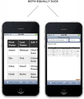
We regularly access charts and tables on our desktop computer to glean valuable information from a pile of data. But, how can you display a full-size, desktop sized chart on a 4″ smart phone screen, and make it remain useful?
 Without properly leveraging responsive design techniques and principles, the user of a small device, like a smart phone, has two choices:
- View the entire table that has been reduced to the size of a credit card, which would require the use of a microscope; or
- Navigate through the table by viewing a small portion at a time.
Neither solution is optimal and will make even the most determined reader leave the site empty handed.
Possible Solutions
While there are many great choices, none of them offer a universal solution. Your table size, format and information will determine the solution that works best for you. In some cases, there will be no great solution for displaying a large amount of information that is formatted in a table on a 4″ screen. Finally, we asked a few developers in the Mobile Gov Community of Practice and they said many approaches are tough to implement so be sure to consult with the developers on your team.
That being said, if using a table is a necessity, we found Chris Coyier, an industry CSS expert, offers some excellent solutions for displaying tables on a smart phone in his article.
 Here are a few of the options he offers:
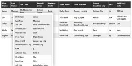
1. Freeze the first column or row and let the user scroll
We freeze rows of columns all the time in Excel sheets so that we can keep track of our place in the table as we scroll up or down.
2. Make each row its own table
On smaller screens the formatting can be changed so that all information on a single value can be displayed together instead of spread across a row in the chart.
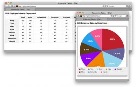
3. Convert the table to a chart
On smaller screens a chart of percentage values could be converted to a pie chart for easy interpretation.
4. Hide the Table
The table could be hidden by default on the page, but easily accessible by tapping to open for smaller screens. This is best when the table or chart is not the only content on the page.
5. Hide the Least Important Columns
In Excel we regularly hide rows that we do not want others to see or deem less important.
6. Select only the columns they want to see
The user can be prompted to select the rows or columns they want to see displayed.
7. Switch the Table from portrait to landscape
Generally users use their phone in portrait mode, however, once a user opens a table it may be best displayed by opening it in landscape mode by default.
8. Remove the table structure
Often times we convert excel files to Comma Separated Values (CSV) files, this just removes all the formatting and blank spaces that were in the Excel sheet, leaving you with rows of data.
You can find more about these approaches in the resources below.
David Fern is an IT Specialist and Technical Leader at the Social Security Administration’s Division of Quality, Testing and Validation. Clair Koroma is a Public Affairs Specialist in the Digital Communications Division of the Department of Health and Human Services. Beth Martin is a Usability Specialist at the Federal Aviation Administration.
YOU MIGHT ALSO LIKE


Share this Post
latest post
-
-
 Web Page Designer Definition September 29, 2018
 -
-
 What is the best Web design software? September 23, 2018
 -
 Best Web design colors September 20, 2018
 -
 Online Responsive Web design September 17, 2018
 -
 Web Page design Perth September 14, 2018
 -
 Best PC for Web design September 11, 2018
 -
 Best Practices for Web design September 8, 2018