
 In his first season as an NFL quarterback, Peyton Manning won three games and threw more interceptions than touchdowns.
Manning would prove resilient however, adapting to the pro-style game very quickly. In eleven of the next twelve years the Colts would go on to win at least ten games per season, and make the playoffs each of those seasons.
What’s Manning’s secret? Most football experts would say it’s his ability to “audible” or adapt, no matter what circumstance he finds his team in.
Being able to easily and automatically adapt is a critical key to survival and success.
It’s true in sports, nature, business, and yes, web development.
What Is Mobile Responsive Design?
When a website is responsive, the layout and/or content responds or adapts based on the size of screen they are presented on.
A responsive website automatically changes to fit the device you’re reading it on.
Typically there have been four general screen sizes that responsive design has been aimed at: the widescreen desktop monitor, the smaller desktop (or laptop), the tablet and the mobile phone.
As you can see in the examples below, as the screen gets smaller, the content shifts and changes to the best display for each screen.
Why Should I Care About Mobile Responsive Design?
 In short, you (publisher, developer, and designer) should care because you want the visitors to your website to have the best experience possible, without forcing them to adapt themselves.
There are essentially two ways you can give your audience a good experience utilizing responsive design:
The first is optimizing the layout of the content.
If a user is browsing from a mobile phone, they generally don’t have a lot of screen real estate to work with. Phones today will typically zoom out automatically, so that the entire website can be seen onscreen. This can be good, as it gives the reader access to the entire sight, but it can also be frustrating when trying to find information that is located in a tiny part of the upper right of the screen. If you could move some things around, make some things bigger and not have as many columns you’ll give your mobile reader a much better experience.
The second is to adapt the content that is shown.
If you own a restaurant and a potential customer is browsing your site from a mobile phone, chances are they aren’t that concerned with how pretty your site is — your foody blog with the awesome slideshow of delectable dishes scrolling from side to side isn’t very useful in that situation. They want to know what your hours are, where you’re located, how to make reservations, and want a look at the menu.
Your potential customer browsing from a desktop computer probably isn’t looking to eat right now, and isn’t in a hurry to see where you’re located and what your phone number is. Most likely he’s looking to see if you offer a good atmosphere and what types food are available.
These are obviously generalizations but you can see the benefits of having differing content presented to people in different screen viewing circumstances.
Mobile responsive design takes care of this all “on the fly”, and without multiple versions of your site to maintain.
How to Easily Create a Mobile Responsive Website
All of this may be new to a lot of you, and fairly intimidating since it requires not only a change in code and design, but in your overall web strategy and philosophy.
Thankfully, the team at StudioPress has their capes on and is here to help you out.
We’ve written several articles that detail how you can get started on your own responsive design, starting with the philosophy behind it and then moving on to actual coding out flexible grids and media queries:
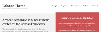
If all that is not your cup ‘o tea, we’ve created several themes that are responsive out of the box. You can view them (and purchase them) below.
And stay tuned, we’re now in the process of making every Genesis Theme responsive…
Mobile Responsive Design is The Future of The Web
Mobile responsive design is all about automatically delivering your audience the content they want, within the context that they’re viewing it.
It is revolutionary for online publishers, because (for most) responsive design eliminates the need for multiple versions of your site, or exspensive app development and maintenance.


YOU MIGHT ALSO LIKE


Share this Post
latest post
-
-
 Web Page Designer Definition September 29, 2018
 -
-
 What is the best Web design software? September 23, 2018
 -
 Best Web design colors September 20, 2018
 -
 Online Responsive Web design September 17, 2018
 -
 Web Page design Perth September 14, 2018
 -
 Best PC for Web design September 11, 2018
 -
 Best Practices for Web design September 8, 2018