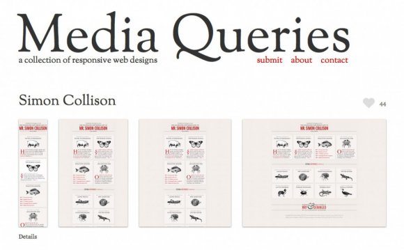
In Lesson 1, we introduced the concept of responsive design and talked about why it was important. Now, we’ll learn a bit about the mechanics of implementing a responsive design. If you’re non-technical, stick with us — it’s important to understand how this stuff actually works! Getting a good handle on the technical constraints and process makes it easier to be thoughtful about design considerations.
- A flexible, grid-based layout
- Media queries
- Flexible images and media
Let’s dive in and learn what each of those means.
Flexible, grid-based layout
First, a bit of background. Traditionally in web design, websites were defined using fixed grids. You’d define the size of a parent container (for example, 960 pixels), and set the components within it to fixed pixel widths, since the layouts would always appear in the same size. No matter the user’s screen resolution, the elements within would be the same width. This was a remnant from the print era — when layouts and grids were fixed.
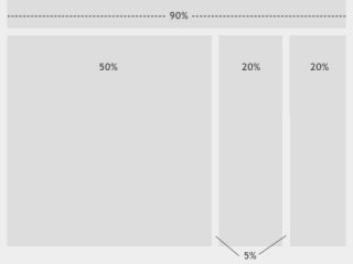
Source: Smashing MagazineBut, as designers thinking about responsive layouts, we have to account for all types of devices and resolutions. If we were using a fixed grid, we would have to manually adjust the height and width of components for different resolutions. So, instead of using pixel-based widths, we use fluid grids to allow our elements and divs to resize proportionally based on our browser dimensions. This is because fluid layouts use percentage-based calculations to figure out the width of elements within the parent container.
 Source: Smashing Magazine
To recap — fixed grids use pixel-based dimensions, while fluid grids use percentage-based calculations. Using relative units allows our layout to resize effectively.
If you were manually creating a grid, you’d use the formula to determine the percentage widths of various elements in your layout:
target / context = resultLet's look at a quick example. If we are using a 960px grid (a grid that has a wrapper container of 960px), and we have one column that’s 300px… we can find the percentage dimensions of that column div with the equation 300 / 960 = 31.25% (target / context = result). Instead of applying pixel dimensions to the elements in CSS, now, we'll use the percentage values instead to maintain a fluid layout.
See A List Apart's excellent article below for a more detailed technical summary of how to implement fluid layouts.
Read a summary of fluid gridsMedia queries
Great, so we know that we can base our site’s layout on a fluid grid that adjusts the size of elements based on percentages of browser width. The other key building block of our responsive design strategy: media queries.
Media queries are a technology built in to the CSS3 specification. A media query allows us to detect certain properties of the browser — like device type, screen size, device orientation (landscape or portrait?), and more. Think of a media query like a browser test — if the browser matches the elements in the media query, it will apply the CSS styles enclosed in the media query. If not, it will just ignore them!
Let’s look at an example media query.
@media screen and (min-width: 1024px) { body { } }The two main pieces of media query syntax: media type (in the above example, it's screen, which means you're primarily targeting computer/device screens as opposed to print preview mode) and the query itself (in this case, it’s min-width:1024px, which means this media query (and its corresponding set of style changes) applies whenever the minimum width of the browser is at least 1024px). For a more detailed look at media queries, syntax, and examples, take a look at the technical specifications below.
CSS media queries on Mozilla's developer siteSo, you can apply specific sets of styles that will only be used in certain browser and device types — which allows us to conditionally serve up CSS depending on the device environment. Media queries allow us to change the layout based on browser size — e.g. we can adjust the number of columns in our layout, hide and resize text / images / columns at small and large sizes, and more. By combining flexible layouts with media queries, we can ensure our designs will work in all dimensions.
Breakpoints
Let’s take a look at a key part of media queries: breakpoints. When we use a fluid grid, the design starts to “break” and no longer look good at certain browser sizes (for example, a one-column layout intended for a mobile browser would probably look bad on a widescreen display that has significantly more screen estate). These points where the design looks off are commonly referred to as “breakpoints”. Responsive sites use a set of breakpoints to define their media queries, and conditionally set responsive styles to update the layout at these points. Here’s an example. As you can see, the breakpoints target different screen widths:
@media screen and (min-width: 300px) { /* ...mobile styles here... */ }@media screen and (min-width: 600px) { /* ...tablet styles here... */ }
@media screen and (min-width: 900px) { /* ...desktop styles here...*/ }
YOU MIGHT ALSO LIKE


Share this Post
latest post
-
-
 Web Page Designer Definition September 29, 2018
 -
-
 What is the best Web design software? September 23, 2018
 -
 Best Web design colors September 20, 2018
 -
 Online Responsive Web design September 17, 2018
 -
 Web Page design Perth September 14, 2018
 -
 Best PC for Web design September 11, 2018
 -
 Best Practices for Web design September 8, 2018