
 So you're leveraging SEO and getting found online. Now that you’re generating traffic by getting found, your next focus should be getting that traffic to stay on your website. Educational websites have a 30-60% bounce rate on average. This means that a large majority of web traffic entering your website leaves without navigating to any other pages. And many times, they may never come back. Yikes! Here are the design guidelines you need to follow to improve your website's user experience and decrease your bounce rate.
1. Make a Great First Impression
Your website represents who you are and what you offer. When people see it for the first time, they’re thinking:
- Is this site credible?
- Is it trustworthy?
- Does it look professional?
- How can I find what I want or need?
- Does this site make me feel welcome?
- Am I in the right place?
You need to ask yourself all of these questions when designing your website. Now, design may not be the most important factor in a website overall, and often-times folks put too much emphasis on how a site looks instead of how it works, but it does play an important role in making a good first impression.
 Tips for a Great Website Design:
Proper Use of Colors: Use the right colors for your audience to draw attention to select elements. Don’t try to make everything jump out. The result will be just the opposite – nothing will stand out. Avoid a chaotic mix of colors on your website, and instead, pick two to four colors for your template and marketing materials.
Animations, Gadgets, and Media: Avoid anything unnecessary. Using Flash animations because they look cool is the wrong strategy. In most cases, it’s best not to use animated backgrounds or background music. Only use media and animations to help support content and information.
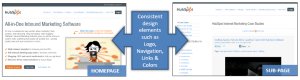
Layout: Create a clear navigation structure, and organize page elements in a grid fashion (as opposed to randomly scattered). Also, don’t be afraid of white space, and avoid clutter!
Typography: Make sure your website is legible. Use fonts, font sizes, and font colors that are easy to read. For easier page scanning, use bullet lists, section headers, and short paragraphs. If your site is English language-based, make sure information flows from left to right and top to bottom. It is almost always best to have white or very light background with black or dark text.
While design is important, don’t forget that great content is what your visitors are ultimately after. A well-designed website might convince visitors to take a closer look, but they won't look twice if the content isn't useful and well organized. After all, you never get a second chance to make a great first impression.
YOU MIGHT ALSO LIKE


Share this Post
latest post
-
-
 Web Page Designer Definition September 29, 2018
 -
-
 What is the best Web design software? September 23, 2018
 -
 Best Web design colors September 20, 2018
 -
 Online Responsive Web design September 17, 2018
 -
 Web Page design Perth September 14, 2018
 -
 Best PC for Web design September 11, 2018
 -
 Best Practices for Web design September 8, 2018