 Never forget that you only have ONE opportunity to make a FIRST impression. Your company’s web page, landing page or email design play a crucial role in creating the first impression of your brand. So keep up with the latest trends to look professional and motivate your potential clients to engage.
We’ve talked a lot about email design trends. But when it comes to a unified marketing strategy, web design is just as crucial. For example, when you guide your subscribers from a responsive email to a landing page, it should also be responsive!
We put together the seven most important web design trends of 2015, so both your main web page and your landing pages are up to date and create a positive customer experience.
#1 Trend of the trends – Responsive web design
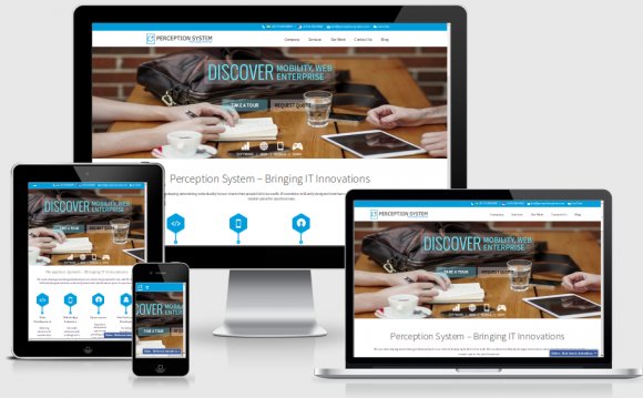
The most important trend of 2015 is responsive web page design. Nowadays people receive information from their gadgets on the go. That is why it is so important to ensure your web page looks great not only on desktop but also on mobile devices.
So, this is where a responsive web design comes in handy! It ensures the web page automatically adapts to different screen sizes. This trend is not new, yet it is important as technologies continue to develop and mobile devices become more and more popular. Web pages that are not mobile-friendly miss the opportunity to reach audiences and sales.
Statistics are shocking! More than 60 % of internet users access websites on mobile devices. Forty-six percent of mobile device users confirm that difficulties in viewing various non-responsive websites is the main reason for leaving the page. Moreover, 50 % of Google searches are made directly from mobile devices, so now Google has optimized its search algorithm to benefit mobile-friendly web pages. This means that by doing a search on the internet from a mobile device, Google will prefer those pages that are designed to be responsive.
 How does a responsive design work? Actually, many don’t know that a responsive design includes both adaptive design and fluid design. Let’s take a closer look at them…
Adaptive design
When using an adaptive design, the size of elements in a web page is defined in pixels (px). As we know, pixels are static in value; the value does not fluctuate according to the size of device. So why is an adaptive design still mobile-friendly?
Adaptive design means a unique design with fixed values in a specified range of resolution. To define the range, when a certain web page is shown, an option called media queries is used, for example media only screen (min. width: 320px) and (max. width: 480px). This means that in this resolution we have created a unique design with fixed and constant values.
The most common practice is to build three or more design options because of the different ranges of screen sizes. This means on the one hand that you will be able to see how the web page looks on any device; but on the other hand, building three design options will increase costs and be more time-consuming.
Take a look at these two examples! Notice the difference between adaptive (left) and static (right) design!
Fluid design
Using a fluid design for your web page means the size of blocks is defined as a percentage. This ensures changes of block sizes according to the user’s screen resolution. All elements of the fluid design web page adapt to both narrow and wide screen. However, it is possible to define minimum and maximum size for the developer to keep control over design. Minimum and maximum size is set by the min-width and max-width, which ensures that your page size will not change its size beyond these values.
Responsive design combining adaptive and fluid
Responsive design may also be formed as a combination of adaptive and fluid design. Fluid design serves as a base for responsive web pages, and media queries are also used. Adding media queries allows for control of the elements when they are reduced or enlarged for viewing on different devices. One of the advantages of responsive design is that there is no need to build separate designs for every device. When reducing the browser window, blocks will automatically jump to the next row.
There’s no doubt responsive web design is an absolute necessity. But it’s not the only one… Our habits and technology are closely linked, so changes in habits are also changing web trends. Let’s find out – what are the other trends we have to take into consideration?
#2 Content scrolling – for a quicker view
Indeed, the new web trends care enough about visitors to provide them with the best user experience! We don’t want to take more than a couple of minutes (or even seconds) to view the web page. So it’s important to provide information fast and in a compact way. A visually extended (long) web page with most of the information on the main page allows quicker viewing. Previously it was common practice to put a lot of links in a web page. Now users just have to scroll down the page to get all the information. No need to wait for the page to load its next section.
YOU MIGHT ALSO LIKE


Share this Post
latest post
-
-
 Web Page Designer Definition September 29, 2018
 -
-
 What is the best Web design software? September 23, 2018
 -
 Best Web design colors September 20, 2018
 -
 Online Responsive Web design September 17, 2018
 -
 Web Page design Perth September 14, 2018
 -
 Best PC for Web design September 11, 2018
 -
 Best Practices for Web design September 8, 2018