 Designing a better experience for signing in is not as easy as it may seem. You want to make the process beautiful, intuitive and fast for your users, but you also need to make the process difficult and slow for non-users (hackers, thieves, and other assorted bad people).
Effortless
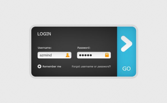
You don't go to the login form to experience the login form itself. You go there because you want to sign in to your account — the form itself is purely a means to an end. For that reason it should be as effortless as possible. Everything is reduced down to exactly what you need to accomplish the task at hand (logging in to your account) and no more.
With the addition of two-factor authentication and all the functionality that entails, the new login process is a lot more complicated than before. Rather than being a simple form with email and password that either fails or succeeds and lets you into your account, there's now a lot more steps: does the account have two-factor auth set up? What authentication method does it use? Various steps including sending to a fallback device or using an emergency backup code. We had to make sure all of these steps flowed completely effortlessly, rather than making it a burden whenever you wanted to access your account.
Placeholders and labels
The matter of whether input placeholders should be used as labels is always a tricky one. From a design standpoint, they look nice. However, they need to play nicely with accessibility and autofill. If you're using the standard placeholder attribute on HTML inputs, then that disappears as soon as the input is filled and you have no idea what the input actually means. This is made doubly bad when the input is filled in by your browser's autofill, so you never see the placeholder.
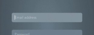 got around this problem by detecting whether an input had been auto-filled, and showing labels in this case. However, if you were to just fill in the form manually, those labels would never appear. We found that people liked the assurance of being able to review the form before submitting it, so this meant the labels needed to be visible all the time when an input was filled.
We think we've come up with a pretty neat solution. Use a separate element to provide the label, and move it out of the field:
Of course, on mobile devices there's not enough room to move the label out leftwards, so we move it up instead:
However, making this all work nicely presented some fun challenges…
When security can get awkward
 When we first wrote the code to control these labels/placeholders, it was very simple: every time an input changes, look at its value. If it's empty, the label goes inside the input as a placeholder. If not, it goes outside. We also do the same check a few times immediately after the page has loaded to check for auto-fill.
There's a problem with this though. Chrome has a security feature (called PasswordAutofillAgent::PasswordValueGatekeeper) where a password field can get autofilled, but doesn't actually have a value until the user has interacted with the page somehow, even though it's visually presented as filled (this makes sense, you don't want JavaScript on the page automatically detecting an autofilled password and posting it off automatically). This was causing our nice labels to do this:
The way around this is to detect whether the input matches the :-webkit-autofill selector, as well as checking for the presence of a value in the input. It's ugly, but it's the only way to make it work.
More fluid than ever
Redirecting your browser to a new page for every step of the login flow is so 2008. It may well be the most compatible and foolproof way to implement a flow like this, but the main part of the GoSquared application doesn't support those edge cases anyway.
YOU MIGHT ALSO LIKE

Share this Post
latest post
-
-
 Web Page Designer Definition September 29, 2018
 -
-
 What is the best Web design software? September 23, 2018
 -
 Best Web design colors September 20, 2018
 -
 Online Responsive Web design September 17, 2018
 -
 Web Page design Perth September 14, 2018
 -
 Best PC for Web design September 11, 2018
 -
 Best Practices for Web design September 8, 2018