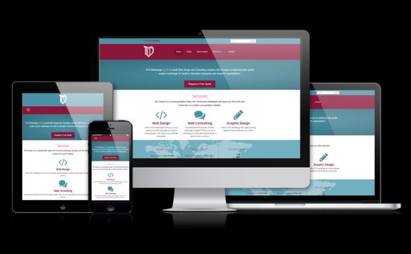
 In a world existing increasingly online, web design is increasing in importance. But as the rate of development increases, staying ahead of the curve is essential to standing out from the crowd. From adaptive designs, to large-format media, to simplified experiences, 2014 promises to be a year of changes; changes you can, and should, implement.
Flat Design
If you’ve heard this term once, prepare to hear it many times again. From the Apple iOS redesign to a multitude of sites around the Internet, the benefits of flat design are being recognized and implemented ubiquitously. For those of you unfamiliar with the concept, flat design eschews 3D and shading techniques, commonly used by designers in the past, for flat colors, simple layouts, and a less cluttered look. The effect of this design choice is a sleek, clean looking interface that hints at modernity and currently sits at the cutting edge of web design trends.
But the benefits of flat design are not simply aesthetic. By reducing the amount of visual clutter, websites become more usable, providing a better experience for site viewers (which means a better shopping experience for potential customers). This occurs because each piece of visual stimuli on a screen, whether links, images, or even shadows, requires some level of processing by the human brain, thus taxing tired eyes and minds. By simplifying the experience, the customer’s mind is free to think about purchase decisions or read valuable content, which means improved revenue and brand impact.
Scroll-to-Sections
In the past, much attention was paid to creating websites with a comprehensive navigation tree, taking great care to segment each piece of content on its own page. The downsides of this approach included the need for users to exert the mental energy necessary to find information, and the unnecessary wait times associated with loading multiple pages. Fortunately for impatient web browsers, savvy developers have developed a new approach to the multi-page problem that incorporates an elegant navigation with a distinctive structure.
Instead of multiple page assets and redundant loading, websites are opting for a single-page look that differentiates content by changing background color and typography as the user scrolls down. in addition, users wanting more information without scrolling can simply click on links that move the page down to the desired section. The net result is a more coherent experience, that is aesthetically pleasing, and easy to use for even casual browsers.
Adaptive Photography
There was a time when web designers were limited to repeating, simple (or solid color) backgrounds due to the limitations of dial-up Internet and resolutions of computer monitors. However, with retina displays and high-resolution smartphones dominating the marketplace, web designers are utilizing attractive, large-format photographic backgrounds for a number of reasons. But the range of devices upon which these are viewed require a little accommodation in order to optimize their aesthetic effectiveness.
Adaptive layouts are the growing trend in web design and their methods should affect everything from navigation to font size. But photographic backgrounds in particular require these same methods in order to provide a coherent experience between desktop and mobile sites. An image, presented in one format on desktop, should present in a similar manner on mobile sites in order to maintain brand and site identity. For this reason, implementing photography the smart and adaptive way is essential.
Typography
But images aren’t the only visual element seeing consideration. In the nascent days of the Internet, text was rendered almost exclusively in the system default font. Even after a greater quantity of fonts was installed on personal computers, designs were limited to the fonts available on those computers, as any font not available on the user’s system would not load. But, in time, solutions were developed that now enable us to load fonts for users, ensuring accurate reproduction of initial design on browsers, and more expressive typography as a result.
YOU MIGHT ALSO LIKE


Share this Post
latest post
-
-
 Web Page Designer Definition September 29, 2018
 -
-
 What is the best Web design software? September 23, 2018
 -
 Best Web design colors September 20, 2018
 -
 Online Responsive Web design September 17, 2018
 -
 Web Page design Perth September 14, 2018
 -
 Best PC for Web design September 11, 2018
 -
 Best Practices for Web design September 8, 2018