 Making the design to be responsive is very easy as shown in my Responsive Design in 3 Steps tutorial, but maintaining the elements to look aesthetically balanced on all breakpoint layouts is an art. Today I'm going to share 5 of my commonly used CSS tricks along with sample cases for coding responsive designs. They are simple CSS properties such as min-width, max-width, overflow, and relative value — but these properties play an important part in responsive design.
View Demos
This responsive video CSS trick was discovered by tjkdesign.com. I've blogged about it before, you may read the details here. It makes the video embed to expand fullwidth to the boundary.
Max-width property allows you to set the max width of the element. The purpose of max-width is to prevent the element from extending the boundary.
 Max-Width Container
In the example below, I specify the container to display at 800px if possible, but it should not exceed 90% of the boundary width.
The above responsive image CSS works on IE7 and IE9, but doesn't work on IE8. To fix it, add width:auto. You may apply a conditional CSS specifically for IE8 or use the IE hack below:
@media \0screen { img { width: auto; /* for ie 8 */ } }
Min-Width
 Min-width is opposit to max-width. It sets the minimum width of an element. In the example form below, min-width is used on the input text field to prevent the input from getting very small when scaling down.
In responsive design, knowing when to use relative value can simplify the CSS and maximize the best layout result. Below are some examples.
Relative Margin
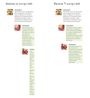
Below is an example of a commentlist where relative left margin is used to space out the threaded comments. Instead of using fixed pixel value, I used percentage value to space out the sub-lists. As shown on the left side of the screenshot, the content box in the sub-lists gets very small on mobile resolution if pixel left margin was used.
 Relative Font Size
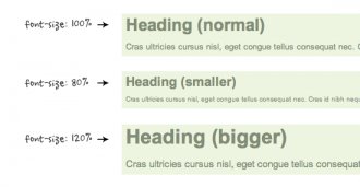
With relative value (eg. em or %), the font size, line-height and margin spacing can be inherited. For example, I can change the font size on all descendant elements by simply changing the font-size on the parent element.
Relative Padding
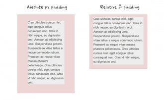
The screenshot below shows it is better to use relative percentage padding as opposed to fixed pixel padding. The box on the left shows an unbalanced padding space if pixel padding was used. The box with percentage padding on the right shows that the content area is maximized.
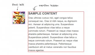
As posted in my previous article, you can clear float with the overflow property. This trick is extremely useful. You can clear the float from the previous element and keep the content running within the container by applying overflow:hidden.
YOU MIGHT ALSO LIKE


Share this Post
latest post
-
-
 Web Page Designer Definition September 29, 2018
 -
-
 What is the best Web design software? September 23, 2018
 -
 Best Web design colors September 20, 2018
 -
 Online Responsive Web design September 17, 2018
 -
 Web Page design Perth September 14, 2018
 -
 Best PC for Web design September 11, 2018
 -
 Best Practices for Web design September 8, 2018