
 Color is one of the most powerful tools in a web designer’s toolbox. It can be used to attract attention, express meaning, create desire, drive conversions, and even earn a customer's loyalty. This is especially important in ecommerce website design where information needs to be communicated quickly and expressively in order to convert casual browsers into committed buyers.
But how can color accomplish all of this and still maintain a consistent brand identity? The answer is to develop an effective color scheme. Every ecommerce website design project should begin with a thoroughly-considered color palette that is used consistently throughout the entire website.
In most cases, a well-developed ecommerce website color scheme will accomplish two things: create a strong brand identity and drive conversion. In the case of brand identity, color can be used to convey meaning or information about the brand, as well as create a sense of uniformity and cohesion between different products on the website. Conversion, by contrast, is most easily driven by the use of contrasting colors. Color contrast can be used to highlight specific products and give strong directional cues.
 To get a better understanding of how ecommerce websites use color schemes to accomplish both of these goals, let’s take a look at a few examples of effective ecommerce website color schemes. Here are 10 ecommerce website color schemes to inspire your next design project.
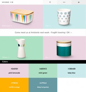
Helbak
Whimsical pastels provide the perfect contrast to the brightly colored detailing on Helbak’s assortment of household wares. Although the pastel backgrounds focus the viewer's attention on the product image, they also help to distinguish product groupings from one another. It’s an excellent example of how a color scheme can create variation while still providing continuity.
Oi Polloi
The playfulness of the Oi Polloi brand comes through in its colour scheme, which is established by the logo and riffed upon throughout the rest of the site. Although at first it seems fragmented, the multivarious nature of the color scheme helps reflect the variety of brands offered by the store.
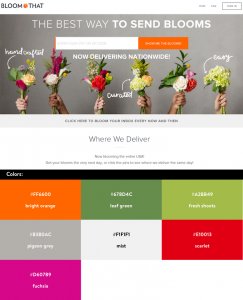
Bloom That
The color scheme for Bloom That does an excellent job at marrying continuity with contrast. The strong orange of the logo in the top left ties nicely with the vivid call-to-action button next to the search bar. Soft greys and muted neutral backgrounds also perfectly emphasize the brightly-coloured product images in the foreground.
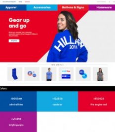
Hillary Clinton Shop
Normally this much red would be overwhelming in other designs, but in the Hillary Clinton store, it packs a powerful emotional punch. Coupled with the cooler blue product images and simple white text, this colourful landing page recalls the red, white, and blue of the star-spangled banner — perfect for Hillary’s patriotic American audience.
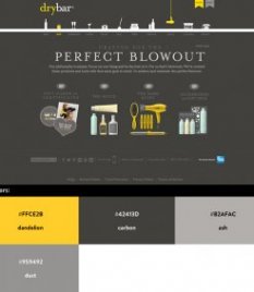
Drybar
This site might not seem much at first, but Drybar another stellar example of color schemes can be used to connect different site elements and give specific directional cues. Once again, greys and neutral tones provide the perfect contrast to the cheery bright yellow, which simultaneously links and emphasizes the brand name, product pictures, and navigational elements.
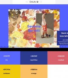
Ohlin-d
Since Ohlin-d’s products are inspired by artwork, it only makes sense that the site design should take its color cues from art as well. In this case, cool blues and purples help to emphasize the significantly warmer reds, oranges, and pinks of the painting and product image. It’s another great example of how colors can work together even in opposition.
William Abraham
This color scheme for William Abraham is all about style. Brilliantly colored product images stand out in sharp contrast to the deep black background. Strong reds and confident blues express authority and conviction, while rich browns add a touch of warmth.
Triangl
Although this website’s strength is in the incredible lookbook imagery, the color scheme of each photo is essential for conveying Triangl’s strong brand and driving conversions. With such distinctively coloured products, it only makes sense to focus the viewer’s attention on the warm colours in the foreground. Contrast is then established by the cooler blues and whites of the background.
YOU MIGHT ALSO LIKE


Share this Post
latest post
-
-
 Web Page Designer Definition September 29, 2018
 -
-
 What is the best Web design software? September 23, 2018
 -
 Best Web design colors September 20, 2018
 -
 Online Responsive Web design September 17, 2018
 -
 Web Page design Perth September 14, 2018
 -
 Best PC for Web design September 11, 2018
 -
 Best Practices for Web design September 8, 2018