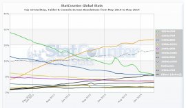 Let’s first look at some of the most popular screen sizes over the years. According to the data Statcounter (a popular free visitor counter) provides, 1024×768 was the most popular size up until March 2012. That month it was surpassed by 1366×768, which is still the most popular today.
The difference between these two sizes? 1366×768 is widescreen with a 16:9 ratio, where 1024×768 has the more traditional 4:3 ratio. This shift marks the change from regular desktop monitors to the still very popular widescreen laptops.
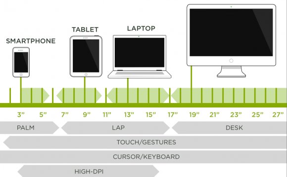
The 1366×768 size is just for display screens ranging from 10.1 to 16 inch, but you can imagine it won’t look that pretty on the latter.
So it’s safe to say that if you decide to use a static size, 1366×768 is your safest bet. That is if you cater a general audience.
1920×1080 (Full HD screens) is on the rise too, especially with a tech oriented audience. This means these people will see your 1366×768 site with large empty spaces left and right.
And did you see the large “Other” line in the StatCounter screenshot? There’s just a whole range of different screen sizes to design for which don’t fall in the listed size categories. That’s where responsive comes into play.
How about responsive?
Making a site responsive is more popular than ever. It allows for one design which is displayed full width on any screen size. Adapting a websites’ view size is regulated with CSS and is based on the viewport of the device a visitor is using. The viewport is the visible part of your website, without scroll bars.
A general assumption is that you can use a responsive design to make a website look good on any type of device. That is not entirely true. A responsive design makes sure that the maximum view space of each device is used when viewing your site. It basically means no horizontal scroll bars. But that doesn’t mean it will actually look good.
To see a live example, please have a look at one of my sites which uses responsive design. It uses a full page background image which I believe looks great on a Full HD monitor (which I’m using myself). The sidebars are still on default settings.
The WordPress theme I use is optimized for responsive, which means, for example, even the call-to-action “Apply” boxes scale down.
Now re-size your browser, and see what happens. The sidebars are moved below the main content, therefore losing their use as sidebars. They become just a bunch of boxes for which no one will take the effort to scroll down to see them. Imagine if you HAD ads put in there: this will severely reduce your earnings. It looks even worse on mobile, toO crammed up which makes your small mobile screen feel even smaller.
While I don’t like the sidebars below the content, I wouldn’t want them placed in between content either. I may be a bit biased since I really don’t like responsive (I decide to buy a larger phone and use desktop sizes instead), but you have to be really creative if you want to make proper use of sidebars.
You basically have to accept the fact that you need to include your most important links and ads in-content or they probably won’t get seen. But you need to be very sure this design still looks good on desktop or tablets (for which you should disable responsive), since it’s bound to mess up your layout if you don’t keep an eye on it.
Responsive design works better for layouts which don’t include sidebars in the first place. But there’s only so much room on smaller screens, so even with an optimized mobile layout you need to decide which content you want to show the most.
So is responsive the best “size” for a website? Probably yes, but life was much easier when we were all just using the same screens.
YOU MIGHT ALSO LIKE


Share this Post
latest post
-
-
 Web Page Designer Definition September 29, 2018
 -
-
 What is the best Web design software? September 23, 2018
 -
 Best Web design colors September 20, 2018
 -
 Online Responsive Web design September 17, 2018
 -
 Web Page design Perth September 14, 2018
 -
 Best PC for Web design September 11, 2018
 -
 Best Practices for Web design September 8, 2018