
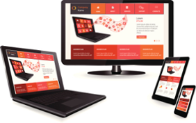 In the last few years, the number of mobile users and devices has grown exponentially. As a result of this, providing a seamless, high-quality user experience on desktop, tablet, and mobile is more important than ever. Responsive Web Design (RWD) is arguably one of the best ways to tackle the issues that arise when designing for multiple devices.
Wikipedia defines RWD as “an approach to web design aimed at crafting sites to provide an optimal viewing experience—easy reading and navigation with a minimum of resizing, panning, and scrolling—across a wide range of devices.” To fully understand why we have RWD and why it is a big deal, it’s helpful to know a little bit of the history behind it.
Fixed-Width Design
Until the last few years, website were specifically designed to fit well on most desktop screens because the overwhelming majority of internet users surfed the web on desktop devices. Most monitors were 800 or 1024 pixels wide and as a result, websites were designed to fit those sizes. However, eventually other size screens began flooding the market, and web designers wanted their sites to look exactly the same no matter which screen users viewed them on.
RWD is the modern solution to the fixed-width problems of the past. Perhaps surprisingly, fixed width designs are still somewhat common. In the early 2000s, terms like fluid design and liquid layout were, sort of, primitive versions of RWD.
The Mobile Revolution
Mobile phones gained the ability to access the internet in the late 1990s but could only display basic textual data. It wasn’t until the mid-2000s when smartphones were popularized that mobile browsers began to display what we now consider to be “real” webpages using CSS 2 and Javascript.
For the first time, cell phones had the ability to display websites the exact same way as desktops, but there was still one problem, they weren’t very navigable for the user. Mobile users had to pinch and zoom to do anything and load times were incredibly slow, especially when smartphones were still running on 3G speed.
Ethan Marcotte: The Godfather of RWD
Web designers and coders may or may not know the name Ethan Marcotte, the man who coined the term “Responsive Web Design” in a paper on A List Apart. In the paper, he described how the design landscape was rapidly changing due to the exponential increase in mobile users. He then proposed that the only way to move forward was to respond to these changes with flexible and fluid web design—RWD.
RWD, at its core, combines three concepts—media queries, flexible widths, and flexible images. Without going too in-depth, it is important to note that none of these concepts were new or revolutionary on their own. However, when Marcotte discovered a way to combine and use these concepts together, RWD as we know it today was born.
Why RWD is Important
Mobile users are taking over, and for companies to be successful in the new mobile-dominant internet space, their websites must be optimized seamlessly for all devices. RWD websites have one URL and one set of code, so you do not need to design multiple websites or worry about multiple URLs; whether the user is visiting a website on a tablet, their smartphone, or a laptop, they will see the same site. And the website will automatically reorient and organize itself to fit the device’s screen being used to view it. With RWD, your website has the right design for every device. Not only that, it will save you money from both a web design and administration standpoint. You only need to design one website, and you only need to administer one website. As if that wasn’t convincing enough, RWD produces the most seamless, high-quality experience you can provide users who are likely to browse your website on multiple devices. All in all, the positives greatly outweigh the negatives when it comes to RWD.
YOU MIGHT ALSO LIKE


Share this Post
latest post
-
-
 Web Page Designer Definition September 29, 2018
 -
-
 What is the best Web design software? September 23, 2018
 -
 Best Web design colors September 20, 2018
 -
 Online Responsive Web design September 17, 2018
 -
 Web Page design Perth September 14, 2018
 -
 Best PC for Web design September 11, 2018
 -
 Best Practices for Web design September 8, 2018