 The KISS principle has nothing to do with the cheesy 70s arena rock band and everything to do with good design. It’s a design principle that originated in 1960 in the US Navy. The acronym means “keep it simple, stupid.” It was coined by Kelly Johnson, one of the most influential and innovative aircraft engineers of the 20th century. Johnson challenged his team of engineers to design a jet aircraft that could be repaired by a mechanic with limited skills and equipped with only a handful of basic tools. At its essence, the principle implies that systems work best if they are kept simple, straightforward and easy-to-use.
Even before the term KISS was first coined, its spirit showed in modern 20th-century design thinking, from the Bauhaus movement in the 1920s (which eliminated unnecessary ornamentation and decoration) up to the current day with Apple’s simple and elegant industrial design and operating systems. The same principle can be applied to user experience and how users navigate their way though a site.
Effective navigation should be like well-designed signage at an airport. A weary traveler wants to find the relevant information in the most clear and efficient manner through the use of verbal and visual cues, as quickly as possible. Ideally, a website’s navigation should operate along the same lines. But without realizing it, clients often insist on bombarding the user with a navigational puzzle by offering too many options and paths, instead of directing their audience to the content they are seeking and “keeping it simple.”
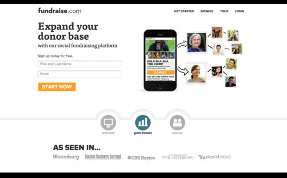
From banks…
Good customer experience and banking are not concepts that usually go hand in hand. In 2012 Simple Bank attempted to change all that by offering users a new approach to banking–one that emphasized ease of use and an intuitive online and mobile experience. This overall philosophy is carried throughout every aspect of the Simple experience, including the way users navigate their site, A large bank like Wells Fargo has close to 100 links in the navigation bar, between primary and secondary links. Simple has three: Features, Testimonials and Sign in. If the user chooses to explore features, Simple does a masterful job of guiding that user by showcasing the primary features that differentiate Simple from their competition and then, at the bottom of the page, offering more specific links to other features, handsomely displayed with icons for each link. Overall, it’s a very streamlined flow that accomplishes its goal of engaging the user to take action.
 …to newspapers
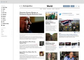
Another site that stands apart from its competition in terms of an exemplary user experience is the NY Times (nytimes.com), which has recently been redesigned. Editorial sites are a good example of how effective navigation can make or break a site, because of their enormous amount of content. Let’s look at how a user interested in world news navigates the news on the Wall Street Journal, which is the second-largest-circulation paper in the US after the NY Times. The World News landing page on the WSJ has 15 secondary navigation links under the World News link in its cluttered header. By contrast, The Times simplifies things and breaks it down to 5 links: Africa, Americas, Asia Pacific, Europe and the Middle East. It’s much easier to digest. In addition, the Times keeps the navigation clean and easy to maneuver by tucking away all of the other sections of the paper in a drop-down menu in the top left section of the header, so the user can focus on the content on the page. As in my bank site example, it’s a very simple solution, but one that sets the New York Times apart in terms of readability and clarity.
YOU MIGHT ALSO LIKE


Share this Post
latest post
-
-
 Web Page Designer Definition September 29, 2018
 -
-
 What is the best Web design software? September 23, 2018
 -
 Best Web design colors September 20, 2018
 -
 Online Responsive Web design September 17, 2018
 -
 Web Page design Perth September 14, 2018
 -
 Best PC for Web design September 11, 2018
 -
 Best Practices for Web design September 8, 2018