 We live in a multi-screen world. I remember growing up as a kid in the 80s and our family of five had exactly ONE screen in our lives. It was the family television (a Sony Trinitron I believe) and we used it to watch TV, VHS tapes and the computer (we had a Commodore 64).
But times have changed… a lot. The other day I was sitting in the living room with my family. Between my wife, our baby daughter and myself, we were all surrounded by screens. We had 2 smart phones, an iPad, an iPod, a LED TV, a Macbook, a Wii U controller AND a baby monitor.
8 screens in JUST one room.
What’s even crazier is that every single one (besides the baby monitor) is capable of browsing the internet. Add that to the fact each one has a different resolution.
This can create a really tricky situation for the modern web designer. Why? Your work of art needs to look sweet on a plethora of devices.
So what’s the modern marketer to do?
One option is just to ignore mobile screens since most people still DO browse the internet on traditional computers, but this isn’t proactive and really limits the shelf life of your next website build.
Statistics suggest that mobile traffic is going to continue to increase over time, which makes sense given the popularity of the new, handheld devices. In fact, according to Mashable, in 2013, 17.4% of web traffic has come through mobile, representing more than a 6% increase since 2012 when 11.1% of traffic came from mobile.
The Challenge
What is a web designer to do with all of these options available for Internet enabled devices? We once focused our attention on catering to smart phone users and provided them with a completely separate mobile version of a website. While this was effective on some level, it was a completely separate web property and required additional development resources, and ultimately costs. The content also needed to be maintained on both versions, which only made things more complex.
The idea of targeting specific devices and resolutions in this day in age is ludicrous. There are more resolutions, phones and platforms then you can list. If you took this approach, by the time you finished targeting and coding for each specific device, your website would be out of date, and it would be time for a redesign. Sounds efficient, right? We didn’t think so.
 However, interestingly enough, the challenge exists on both ends of the resolution spectrum. Not only are more and more people viewing web content on limited displays (such as smartphones or tablets) but they are also viewing content on really high-resolution displays (such as HDTVs).
The “Non-Ideal” Solution
At a bare minimum, we need to focus on compliance. If we are OK with users having to pan and zoom to view web content on their mobile device (which we really shouldn’t be) then, all we need to do is make sure our sites have some base line compliance. Here’s what you should do:
- Avoid Flash, Quicktime or any other plugins that might not be available to a mobile user
- Don’t exceed 960px wide or people will be in scroll city
- Don’t use fonts smaller then 11px
- Make sure primary site navigation is fairly large
But the real question is, is this good enough? Are we willing to settle for this solution?
The Ideal Solution
The ideal solution in this case is Responsive Design. The overarching idea of Responsive Design is to build a single web property that has the ability to dynamically change its display based on the device it is used on (regardless of hardware or software platform). This applies to both low-resolution devices as well as really high-resolution devices.
The picture above shows responsive design in action. It shows how the website designed with responsive design appears on multiple devices. Remember, it’s still the same website (we haven’t designed a separate mobile friendly version), but no matter what device our end customer is using, the site is optimized.
The reality is that Responsive Design is more the idea of having a single website that renders well on a multitude of devices. It’s still in its early years, but we are seeing more and more sites developed that are responsive.
There is a great debate in the development world on what the best way is to go about making your site responsive. The solution we’ve rested on here at New Breed, as have many of our colleagues, is starting our websites with the Twitter Bootstrap framework.
The Execution
Now that we’ve hopefully piqued your interest and you can see why responsive design is important, we want to show you how you can implement it within your own organization.
Responsive design begins with your website, but quickly becomes a deeper part of your marketing strategy. How you may be wondering? First off, as we mentioned in this post responsive design is an essential component of your web presence that is becoming more and more necessary as internet browsers change their behavior.
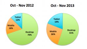
The first step when contemplating a redesign of your website using responsive design is to look at your analytics. What types of devices are your visitors using to access your site? If you still have an audience that primarily uses their desktop, then responsive design might not be a necessary shift for you to make. But on the flip side, if your traffic has changed their behavior and are now using tablets and mobile devices to access your site, then you could greatly benefit from a responsive website.
Take a look at the charts below, which compare our actual traffic sources from this time last year to now. These charts represent the massive shift that is happening online.
If your charts look anything like this, then we encourage you to consider redesigning your site with responsive design for a few reasons. When your site is responsive, here are six positive effects you can expect to see:
1) Increased Conversions
In our previous post on the Insiders Blog, we talked about how you can maximize conversions with a sales ready website. This is the same methodology – if your website is sales-ready (i.e. there are clear conversion paths mapped to your buyer personas), you will be on your way to maximizing your conversions.
Part of having a sales-ready website is having the website designed to be responsive. Since a responsive website caters to the specific device a visitor is using, the overall experience with your company is improved and the user is not as likely to go to your competitor.
YOU MIGHT ALSO LIKE


Share this Post
latest post
-
-
 Web Page Designer Definition September 29, 2018
 -
-
 What is the best Web design software? September 23, 2018
 -
 Best Web design colors September 20, 2018
 -
 Online Responsive Web design September 17, 2018
 -
 Web Page design Perth September 14, 2018
 -
 Best PC for Web design September 11, 2018
 -
 Best Practices for Web design September 8, 2018