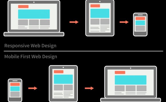
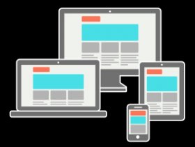 You might or might not already be familiar with the term “responsive”. It is used to describe the possibility of websites adapting to various output devices. The layout, fonts, image sizes etc. change and or scale according to the size of the browser. This principle enables good readability and usability on desktops, tablets and smartphones. If you’re reading this on a desktop, you can see the effects of the responsiveness by scaling the browser window. Make it very narrow to simulate the look of this site on a smartphone. This website shows some lovely examples of responsive website behaviour.
This “responsive webdesign” has been around for a couple of years, and has been totally standard since at least 2012. Take your stuff and run, if your web designer is not aware of the necessity to cover mobile devices with his design.
But actually, it is well worth mentioning that the responsive behavior of websites is not the latest thing anymore. The latest buzz is: Mobile First. We’ll explore all the terminology in this article, and make clear the differences. Furthermore we’ll have a look at how it affects design workflow and communication with clients.
The term “mobile first”, being very descriptive, already gives us a good hint of what to expect: primarily focusing on development for mobile devices. The common responsive approach works with the desktop browser as the basis, and offers alternative, scaled down versions for other device/browser sizes. That works via CSS media queries, which check the browser size and adjust the layout and styling according to that.
Conceptually starting with displaying a website on mobile devices, rather than on a desktop, leads to a quite different approach on how to deal with content. Mobile first means content first. We love that. Fancy hover menus, sliders, flash-based animations – all the clutter is taken away at the beginning, and instead of focusing on effects what is being considered is how to display the content in the most rational way. If there is a need for a visually stunning web appearance, all the eye candy can of course be added, especially for desktop and tablet versions. But, to reiterate, where you start conceptually is a very minimalistic place.
The approach of responsive web design is often more trivial. It simply hides certain objects or simplifies them for mobile users. But it’s still there. Often the javascripts and assets are still being loaded, and the designer’s mind has been occupied with all of them while approaching the project.
Workflow for Designing ‘Mobile First’
We do enjoy starting with a blank piece of paper (or a blank photoshop canvas) when we’re beginning a new project. Not only because nothing symbolizes creative freedom more than those, but also because it’s a good right brain hemisphere way of approaching tasks.
The introduction of responsive web design, and even more the mobile first approach, reduces this ‘photoshop time’ rapidly. The blank canvas is not an appropriate metaphor for the web anymore. The width and height are as dynamic as they could be with all those rotate-able, different sized devices out there. No end in sight. Therefore we still do not skip the step of the blank canvas, but it’s essential to not get stuck there. Moving on to the code and functional mockups as soon as possible is the current best practice. We quite often have to explain to clients that photoshopping various sized versions for print-out would not be our way of efficiently approaching the project. If it’s supporting a smooth sign-off process we of course give in, but it’s being created especially for the client in that case. Our approach is more and more that of designing by coding.
We ❤ this algorithmic approach for creating beautiful websites.
Why are we telling you this? We are constantly improving the transparency in communication with our clients. Being honest and clear about the process, what it means for us, and how it can be optimized is therefore not only in our interest, but also yours! We hope we have been able to give you some insights in the recent development of web technologies, and how it affects the client-service provider relationship. Please share your thoughts and questions with us in the comments.
YOU MIGHT ALSO LIKE


Share this Post
latest post
-
-
 Web Page Designer Definition September 29, 2018
 -
-
 What is the best Web design software? September 23, 2018
 -
 Best Web design colors September 20, 2018
 -
 Online Responsive Web design September 17, 2018
 -
 Web Page design Perth September 14, 2018
 -
 Best PC for Web design September 11, 2018
 -
 Best Practices for Web design September 8, 2018