 One thing that has always amazed me when I have been on the hunt for a freelance designer, was how some of them rarely bothered to make their own homepages visually appealing. You would think that a great designer would consequently have a great website, but more often than not, this is not the case.
Surprising, considering the fact that the webpage of a designer is basically an advertisement of their own design ability. Admittedly, the portfolio is where most of them focus their energies, but at the end of the day the first thing a future client sees is the website, so it makes sense to make it great.
These websites do that very well. So well infact that they are in my opinion, some of the best on the web! Check them out and let me know what you think in the comments!
Caitlin McEvoy
First off, i cannot believe how young this talented designer is. Only 21! The way she has designed the site is a personal style preference of mine. Letting the design do the talking. And boy does it speak for itself. The designs shown, use typography incredibly well. There is also a great use of color within the examples designs on the page aswell. It goes to show that good use of these two things almost completely compensate for a lack of other design elements. They, when done well, bring life to an otherwise black and white page. In short, this is minimalism the way it should be done.
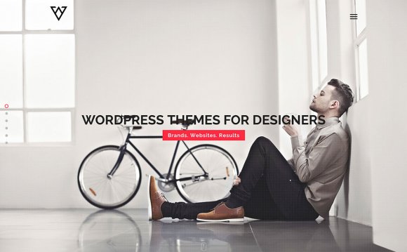
 TapTap Design
Two things i love about this design. 1. The simplicity of it. and 2. The use of color. The blue is very easy on the eye and mixes very well with the very contrasting black. All around, a very effective freelancer site.
Netseed
You know a designer is ballsy when they use a color like the one used on this site. It is pulled off VERY well though, in my opinion. If i was looking for a web designer, this site would make me want to know more, because it strikes my attention with the dominant color and graphics that it uses. It is making a firm statement, with the brave use of a single, dominant color, something that says a lot about the firm that is behind it. It also engages you instantly, which is useful when your prospective clients may have MULTIPLE tabs open at once.
Danny Diablo
I don’t usually like black as a color choice for websites, mostly because it has a slightly negative/dark feel to it. But with the light gradient and orange/white complimentary colors, it seems to work for this site quite well.
Passion About Design
This design doesn’t really show much in the way of examples of previous work, but it does in and of itself, show what the designer is capable of doing. The colors on the site are very ‘serious’, giving you the feeling that this designer is the same. Its also interesting that he shares the books that he’s reading at the moment. This tells you a lot about the person behind the design. Which i would argue, is even more important than the examples of their previous work. It can tell you, without seeing anything else, if this is a person that you would like to work with.
Jure Stern
This design is very relaxing and quite easy on the eye. It displays all the information you need to know in a very concise and succint way. I would hit the contact button, without even looking at the design examples that he’s done!
YOU MIGHT ALSO LIKE


Share this Post
latest post
-
-
 Web Page Designer Definition September 29, 2018
 -
-
 What is the best Web design software? September 23, 2018
 -
 Best Web design colors September 20, 2018
 -
 Online Responsive Web design September 17, 2018
 -
 Web Page design Perth September 14, 2018
 -
 Best PC for Web design September 11, 2018
 -
 Best Practices for Web design September 8, 2018