 Ethan Marcotte is a keynote speaker at Generate New York, which will take place on 20 June 2014. Enter the code generate100 at the checkout this week to get $100 off your ticket!
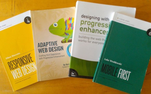
"I'm an independent designer, based in Boston, " he says, reclining, sipping and smiling. "I've just been living and working in the northeastern United States for the last 15 years or so. Throughout my career I've been fortunate to work the likes of New York Magazine, the Sundance Film Festival, The Boston Globe and People magazine. But I'm most recently known for coining the term 'responsive web design', back in 2010."
A career, not by design
Despite being one of the web's best-known designers, Marcotte's internet career began quite by accident. "I was a literature major in university, " he tells us. "At some point during my four years of study I got a copy of Photoshop and just started messing around with web design. First it was for myself, and then some side projects. From there I did some freelance projects for student organisations."
After four years of study, Marcotte found himself needing a break from academia. "Back in 1999, everyone was talking about this internet thing, " he recalls. "I thought, 'I know a few things about this internet thing', maybe I could get a job there? I got my first studio job a year after school, and that was where the web got its hooks into me."
 During that time, Marcotte worked with an array of web professionals: photographers, fine artists and former architects. They were people, he tells us, who had just stumbled into this new medium. "It brought, " Marcotte recalls, "a real multidisciplinary approach to projects... that just stayed with me. It probably sounds a bit hackneyed, but I fell in love with this industry because of the people." By way of a summary, Marcotte says, "So, I guess, I'm 15 or 16 years into taking a couple of years off before grad school."
Responsive's genesis
I have to ask the obvious question: how did responsive design come about? Was the idea - that we should stop trying to tame the wildness of the web and roll with it - already germinating in various corners of the industry? Or did he have a classic eureka moment? The name, he tells us, did indeed come about suddenly and unexpectedly.
The philosophy behind responsive, by contrast, crystallised more slowly. Back in 2000 Marcotte read John Allsopp's 'A Dao of Web Design'. "I stumbled across John's article, " Marcotte recalls. "At the time, web design was something I enjoyed, but I saw it primarily as a job: something I showed up to, from eight to six every day. John's article showed me that the web could be a place for, I don't know, craftsmanship? That this could be a place where people can do really brilliant things."
In that watershed piece, Allsopp told designers it was time for the web to move beyond its controlled, pixel perfect, print origins. The web's strength, Allsopp wrote, is its flexibility and it should be embraced. Designers shouldn't strive to tame the web and make it work like print.
John's article showed me that the web could be a place where people can do really brilliant things
"John talked about designing 'for the ebb and flow of things', and that made a big impact on me. I got really excited about moving away from this notion of fixed-width interfaces, " Marcotte tells us. "In other words, we should take the web on its own terms and stop defining it by the physical boundaries of the printed page. The industry kept having this discussion about when it was 'safe' to upgrade the width of our designs. [John's article] urged us to think about making designs that followed the shape of the browser, to letting the user's preferences take hold."
YOU MIGHT ALSO LIKE

Share this Post
latest post
-
-
 Web Page Designer Definition September 29, 2018
 -
-
 What is the best Web design software? September 23, 2018
 -
 Best Web design colors September 20, 2018
 -
 Online Responsive Web design September 17, 2018
 -
 Web Page design Perth September 14, 2018
 -
 Best PC for Web design September 11, 2018
 -
 Best Practices for Web design September 8, 2018