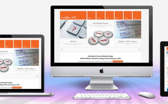
 Much like fashion, web design is constantly changing with trends and fads coming and going. When it comes to creating a website that will make a professional impression, you will always do well to keep everything up to date and on trend. After all, when you go to an interview don’t you want to look your best?
If you answered “absolutely!” then here are 5 crucial web design tips to keep in mind:
1. Keep it clean and clutter-free
The world around us has become quite cluttered and the web is no exception. Ads, banners, icons, badges, signs, pop-ups, buttons, and so on – sometimes it can all get a bit heavy. So why not give your site visitors a break from all the noise and clutter? Embracing things like flat design and white space (you can read more about both these terms here) can do wonders for your site visitor’s experience. Try to keep everything simplistic or even minimal with only your most important content spotlighted. Sometimes less really is more.
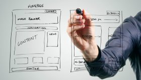
2. Do some web design recon
If you’re reading this blog, you’re already on the right path. But you can take your research a step further and start looking at websites with a specific purpose: to figure out what you like about them and what you don’t. Make some mental or actual notes on what you would like to emulate on your own site. Do you think a long scrolling page would work well with your site? Maybe you really admire someone elses approach to their contact page. It can be something as small as imitating a use of an arrow icon that points to an important message. Whatever it is you find appealing, think about how you can make it happen in your own website’s design scheme.
3. Put visual hierarchy to use
Visual hierarchy, what’s that again? It’s a term that basically means our eyes pay attention to web space in a certain pattern – a pattern that can help you optimize important content on your site. For example, if you create a ‘sign up now’ button, you likely want as many people as possible to click it and follow-through with the sign-up process. Visual hierarchy tells us that the eyes move top to bottom, left to right. This means you’ll get the most eyes on your button in the top left corner of your site, and those eyes could very well mean more clicks. Remember, only put your most important content in these coveted spaces – if you put too much in one spot your visitor will be overwhelmed and you won’t get the result you’re aiming for.
4. Make your text easy to read
Text is important. It’s there to provide information and answer questions even before they’ve been asked. With that said – don’t make your readers squint to read it. There are a few simple rules you can adhere to that will keep you and your text in the clear.
- Make sure your colors work together. For example: putting cream colored text on a white background will either leave your site visitors with a headache or make them give up and move on. Neither of these outcomes are desirable – so make sure you double check all your text for it’s ease of readability.
- Don’t use uber-tiny font size. While it might look cute, it’s just not practical. Make sure your readers won’t need a magnifying glass to figure out your message.
- Stand by your fonts. Create a theme and even carve out a brand where your site sticks to no more than three fonts – two might even be better. For extra points, make sure the fonts you choose are reader-friendly and don’t leave your visitors wondering if they’re reading Sanskrit.
5. Get the most out of the mobile version of your site
YOU MIGHT ALSO LIKE
Share this Post
latest post
-
-
 Web Page Designer Definition September 29, 2018
 -
-
 What is the best Web design software? September 23, 2018
 -
 Best Web design colors September 20, 2018
 -
 Online Responsive Web design September 17, 2018
 -
 Web Page design Perth September 14, 2018
 -
 Best PC for Web design September 11, 2018
 -
 Best Practices for Web design September 8, 2018