 In this section, the web page created in the CSS3 Advanced section will be used. Restore the browser window and reduce the size of the window further and see what happens. The design of the web page collaped. To make it responsive, we are going to use CSS3 media queries.
CSS3 media queries will be applied for devices with screen width between 150px and 780px using the below code,
@media only screen and (min-width : 150px) and (max-width : 780px) { }
The property ???min-and max-width: 780px??? means that the code in between { and } is executed only for devices with screen width between 150px and 780px.
Rewriting the entire CSS rules is not necessary. It is enough to specify rules that needs to change for mobile devices like navigation bar, etc.
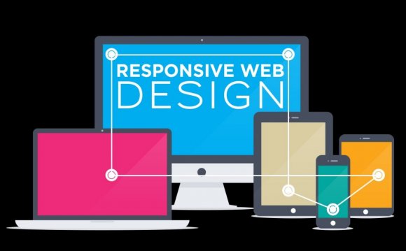
To understand responsive web design, you must workout this example, This section is the most important section in this entire website. If you didn't workout this example, understanding the later section will become hard.
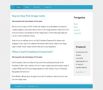
This is what we are going to create in this step by step tutorial. Click on the image to visit the example website. Try restoring the browser window to see what happens, the web page will automatically respond to the size of your browser window.
YOU MIGHT ALSO LIKE


Share this Post
latest post
-
-
 Web Page Designer Definition September 29, 2018
 -
-
 What is the best Web design software? September 23, 2018
 -
 Best Web design colors September 20, 2018
 -
 Online Responsive Web design September 17, 2018
 -
 Web Page design Perth September 14, 2018
 -
 Best PC for Web design September 11, 2018
 -
 Best Practices for Web design September 8, 2018