 This is a guest post by Gregory Ciotti from Help Scout.
How do people view, browse, and use your site? While testing will be the final judgement for what works on your site, conversion studies can be a great place to begin when designing your site.
Be sure to take careful note if your site is making any of the following mistakes, and try implementing A/B tests with my corrections; I have a hunch you'll see a noticeable change in your bottom line!
1. Lack of a Clear Value Proposition
Your value proposition is the #1 thing that determines whether people will bother reading more about your product or hit the back button. If I could give you only one piece of conversion advice, “test your value proposition” would be it.
A strong value proposition is your argument as to why customers should buy from you when they could buy from the competition. This is especially important for ecommerce, because why should customers buy from you when they could buy from Amazon?
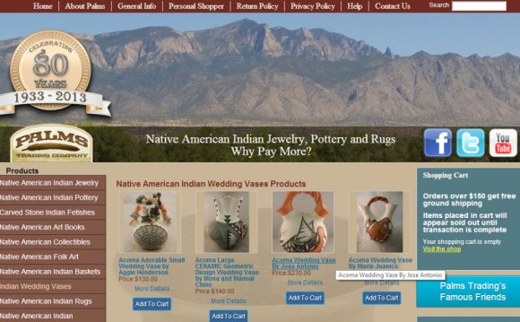
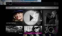
Unfortunately, not only do many ecommerce sites have poor value propositions, but many sites even have difficulty communicating exactly what they sell! I don't mean to pick on Yummy Tummy—a great soup and baked goods company—but landing on their site is one of the more confusing experiences I've had online:
What exactly am I buying here? If I can't figure it out soon, I'm likely to leave.
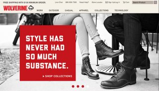
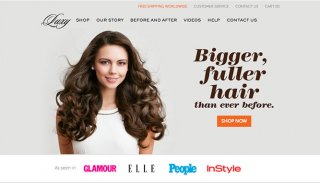
Both of these examples also make great used of images in their value propositions. Although clear, concise copy is very important for every website, remember that images can also tell a story about a product. As legendary advertiser Claude Hopkins would say:
Use pictures only to attract those who may profit you. Use them only when they form a better selling argument than the same amount of space set in type.
The essential elements of any good value proposition include the following items:
- A headline (possibly with subheadings) that uses simple, clear language as to why an item is worth purchasing. It's not a slogan, it's a promise of value, such as "Create a professional client proposal in minutes, " as seen on Bidsketch.
- Body copy explaining why buying this item from you is the best choice.
 What do you have to offer that others don't? Why are you different?
 - Additional benefits and social proof (elements like free shipping and guarantees).
- Images that create desire by showcasing the item in use.
When people understand what they are buying, and why they should buy it from you, I guarantee that your site will see an increase in sales over a design that doesn't communicate clearly with customers. People often don't know why they might need your product until you tell them ("You'll love our newest product because..."), so don't be afraid to be direct and crystal clear.
2. Misguided Product Descriptions
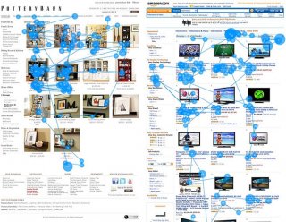 Here's what they found:
Thumbnails of bookcases were studied intensely, whereas thumbnails of flat-panel TVs were mainly ignored. In fact, on the full Amazon page, only 18% of the viewing time was spent on the photos, while 82% was spent on the text.
The comparison was between bookshelves and shelving on the Pottery Barn website, and TV listings on Amazon. When you think about it, the difference in the products is quite clear: most people buying a bookshelf care about how it will look in their room. Most people buying a TV do care somewhat about how it looks, but are mostly concerned with the specs (how big, Plasma or LCD, is it a smart TV?, etc.)
As the Nielsen write-up would so humorously point out:
The TV photos are of no help in deciding between the products. A guy in a canoe vs. a football player? What, because I watch more football than water sports, I’ll buy the TV showing a football player?
That's in contrast to a bookshelf, where cherry colored vs. oak colored matters. You can incorporate this information into how you handle product descriptions by really thinking about your product and how your customer shops for it.
Do they care mostly about how it looks, or about what it's capable of? Adjust your image use and product descriptions based on this need, and you'll have far more informed and happy shoppers.
3. Failing to Properly Utilize Quality Images
If you happen to sell items that are mostly dependent on looks (like the Pottery Barn example above), you should know by now that the visuals that you use are incredibly important.

YOU MIGHT ALSO LIKE

Share this Post
latest post
-
-
 Web Page Designer Definition September 29, 2018
 -
-
 What is the best Web design software? September 23, 2018
 -
 Best Web design colors September 20, 2018
 -
 Online Responsive Web design September 17, 2018
 -
 Web Page design Perth September 14, 2018
 -
 Best PC for Web design September 11, 2018
 -
 Best Practices for Web design September 8, 2018