 By Keith Bryant
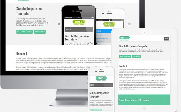
Recently, we reviewed how you can create your own print stylesheets using some helpful CSS code. Using some similar styling techniques, you can also add responsive design to a WordPress theme or standard HTML and CSS website. Responsive design is a new trend in web development that perhaps seems complex – but it's actually quite straightforward once you master some basic CSS rules.
What is Responsive Web Design?
With more and more website and blog visitors browsing the web from smartphones and tablets, web designers need to adapt to this by creating websites that are optimized for mobile browsers. The standard way of designing mobile websites has traditionally been to create different versions of your website for tablets and smartphones, meaning that you may create a standard website that is intended for desktop computer viewing, a tablet website that is optimized for devices like the iPad and Android tablets, and a smartphone microsite that is optimized for devices like the iPhone and Nexus smartphones, etc.
With the newer trend of responsive web design, however, a web designer can simply tweak the existing website using just CSS (adding, removing and modifying elements along the way), to create different versions of a website or blog without changing the content. Accordingly, many web designers use responsive design to create different website views for desktops, smartphones and tablets.
Do You Need It?
While implementing responsive web design is not mandatory from a functionality standpoint, it is a great option to add to an existing website or blog for the convenience of your site visitors and members. You've probably used a smartphone before to browse a website that featured only a normal, desktop view. In doing so, you may have noticed that browsing through the site wasn't the easiest – it required a lot of zooming in, scrolling, etc.
 The reality is that mobile web browsing is exploding. With more and more users coming to your site from mobile devices, it's important to consider accomodating them. With responsive web design, you can use standard CSS rules to create a mobile-targeted version of your website that provides an enhanced user experience for these visitors.
The Basic Code
You can easily get started on creating your responsive design by adding some basic rules to the CSS stylesheet for your WordPress blog or standard HTML website.
First, though, you must add a viewport meta tag to the section of your HTML page or WordPress theme's header template. This tells mobile browsers to display the page at full size instead of scaling it:
By telling these smaller devices not to scale the content, that means we have fewer pixels to work with. Our next step is to add the CSS code that controls the display in these small-screen situations.
This is where special @media only screen code comes in, which needs to be added to your CSS stylesheet. Here is an example:
@media only screen and (max-width : 480px) { }
Here, we've commented the CSS to label the Smartphone View because it will incorporate the code needed to optimize our site for smartphones. We've also used the @media only screen function to define the max-width (maximum width) as 480 pixels. This means that whenever a web browser window or device screen has a width of 480px or lower, it will automatically apply the contained rules, swithching the layout to "smartphone view."
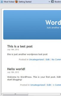
 Now, we can add some rules within this query to start making our website responsive. Let's use a WordPress theme as a guide. Here is the unmodified default theme from older versions of WordPress, pictured in a browser window that is sized below 480px:
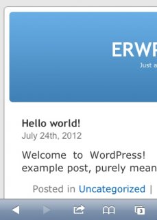
Notice how the theme in unresponsive – instead, we're left with the dreaded horizontal scrollbar. Here is the view from the iPhone's Mobile Safari browser:
Because we added the viewport meta tag, the page hasn't been scaled down as usual. Instead, it has been cut off, requiring scrolling for it to be read.
To address this, let's add some basic display and width definitions to the starter template code:
@media only screen and (max-width : 480px) { #sidebar { display: none; } #content { } #header { display: none; } }
We hide the sidebar and header, and set an explicit width for the content area.
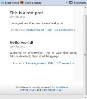 Here is the effect of adding just the three lines of code featured above, from a narrow web browser view:
Similary, here are the updated results on the iPhone:
Notice how the view is now much simpler and optimized for a smartphone's small screen. With these simple changes, we've added entry-level responsiveness to our site!
That's how easy it is to get started with responsive design. To take it to the next level, you simply need to apply more styles and CSS rules to the Smartphone View CSS. For example, you could now add a new header image, specifically designed for a small smartphone view.
Tablet View
By adding another similar section to your site's CSS files, we can add a tablet-optimized view as well. Here is an example:
@media only screen and (max-width : 650px) and (min-width : 481px) { }
By defining the max-width as 650px and the min-width as 481px, the smartphone view we created earlier will be used when the screen (or browser window) is 480 pixels or less in width; however, once we move up to 481px to 650px, the CSS rules contained in this second query will automatically be applied instead. These rules make up our tablet view. Just as with the smartphone view, the precise CSS you use depends on your layout and design tastes.
Priority of Views
Note that it's important to specify smartphone- and tablet-specific CSS at the end of your stylesheet. By doing this, we ensure that our special rules overridde the default rules.
Update: As ultrageoff mentioned below in the comments, there is an exception to this rule. When you are specifying large background images in CSS for the standard view for your site, you should create a separate @media only screen section that targets only large screen sizes. Place the background-image declarations within that special section. Otherwise, devices with small screens will try to start loading those large images, negatively impacting loading performance. Because IE versions 8 and older don't support media queries, you should also place these background declarations in a separate IE-specific stylesheet for your page.
YOU MIGHT ALSO LIKE


Share this Post
latest post
-
-
 Web Page Designer Definition September 29, 2018
 -
-
 What is the best Web design software? September 23, 2018
 -
 Best Web design colors September 20, 2018
 -
 Online Responsive Web design September 17, 2018
 -
 Web Page design Perth September 14, 2018
 -
 Best PC for Web design September 11, 2018
 -
 Best Practices for Web design September 8, 2018