
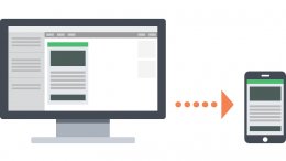 Mobile is a wildly popular topic in email design, which makes sense—emails opened on mobile devices have grown more than 400% since 2011, and mobile email opens hit the 50% mark in 2013. We’ve talked before about how important mobile has become to email marketers and the need to optimize campaigns for mobile audiences. But it’s not always clear which strategy works best for mobile audiences.
To make matters worse, many marketers are confused about what strategies actually exist. Eliminating the possibility of not doing anything at all, mobile email design can roughly be broken down into three categories:
- Scalable Design
- Fluid Design
- Responsive Design
For marketers to choose the approach that best suits their needs, it’s important to understand the differences between these three approaches.
Scalable Design
Let’s begin with what many email marketers are currently using: scalable design. Scalable design can be defined as any design that works well across both desktop and mobile without using code to adjust table or image sizes, or display or hide content between the two platforms. While we’re using the term “scalable” to describe this approach, you may have also heard these concepts referred to as mobile aware, mobile friendly, agnostic or mobile first.
Scalable designs are typically the easiest to implement. Since scalable emails don’t adjust the widths of tables or images between devices, and don’t use CSS media queries (we’ll get to those later) to swap content or change the size of text, it’s important to use a number of techniques to keep the content of scalable emails enjoyable not only on desktop, but when viewed on mobile devices as well.
- A simple (usually single-column) layout that scales down nicely.
- Large text that is readable on screens of all sizes.
- Large, touch-friendly calls-to-action.
For more information on scalable design, Lauren’s post on the differences between scalable and responsive design is a great place to start. Our Anatomy of the Perfect Mobile Email infographic is another excellent resource.
One thing to keep in mind when designing scalable emails (or any email) is the Android “Grid of Grim.” In some Android email apps, messages are not scaled at all, resulting in the need for subscribers to scroll both vertically and horizontally. Ideally, you should place the most vital information in your campaign on the left side of your email—keeping things like logos, important copy, and CTAs visible without having to scroll horizontally.
When optimized using the techniques above, scalable emails are a great way for marketers to engage with their mobile audiences without the need to drastically change process or introduce new workflows. They typically require no extra coding or knowledge beyond what most email designers already know—it’s just a matter of making mobile users a priority and altering the overall email layout to accommodate their needs.
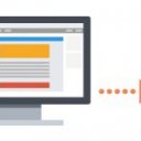
Check out these great examples of mobile-optimized, scalable emails:
 While scalable emails are good for teams that need a quick solution, more advanced solutions allow for better control over campaigns on different devices.
Fluid Design
In between scalable and responsive is what we term “fluid” design. Fluid emails use percentage-based sizing to make the width of tables and images adapt to the screen size on which they are viewed, similar to what is known as “liquid” layouts on the web. Fluid emails are similar to scalable ones, in that they don’t purposefully alter the layout or content of an email, but they have the added benefit of having content “flow” to fill space on the screen. For this reason, fluid designs typically work best for text-heavy layouts since there’s less control over how copy and images relate to each other.
Implementing a fluid layout is relatively simple. Instead of using pixels for sizing tables, you use percentages.
...Content...However, Campaign Monitor makes a good point that you will need to constrain the width of your emails on larger screens. If left completely fluid, emails on these screens will be too wide and the copy will be hard to read.
Line lengths can become unwieldy in unconstrained fluid layouts
While websites can use the CSS max-width property to constrain the layout to a specific size, this technique isn’t widely supported in email clients. However, we can use alternative methods for limiting the width of a layout. The best way to achieve this is by wrapping the content of your email in a container table with a fixed width.
Then, you can make that fixed width fluid by targeting it in a media query:
@media screen and (max-width: 525px) { table{ width:100% !important; } }
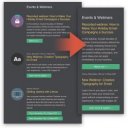
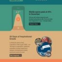
Now, your tables and images will flow beautifully on most mobile devices, while still being readable on larger screens, just like some of these great emails:
It should be noted that fluid email designs are becoming less common these days. Fluid tables and images are almost always coupled with responsive design techniques to allow for the most control over email designs. Don’t let that discourage you from using fluid techniques, though! It’s still an excellent way to optimize for mobile if you don’t have the resources to devote to a completely responsive template.
YOU MIGHT ALSO LIKE


Share this Post
latest post
-
-
 Web Page Designer Definition September 29, 2018
 -
-
 What is the best Web design software? September 23, 2018
 -
 Best Web design colors September 20, 2018
 -
 Online Responsive Web design September 17, 2018
 -
 Web Page design Perth September 14, 2018
 -
 Best PC for Web design September 11, 2018
 -
 Best Practices for Web design September 8, 2018