 In 2012, for the first time ever, the sales of personal computers dropped. Why? Tablets sales, for one thing. Tablet sales are expected to exceed 100 million this year. Their sales numbers may top notebooks next year. Mobile sales have already overtaken desktop sales and mobile Internet usage is predicted to overtake desktop internet usage by 2014. It is only logical that mobile search will overtake desktop search at some point in the near future as well.
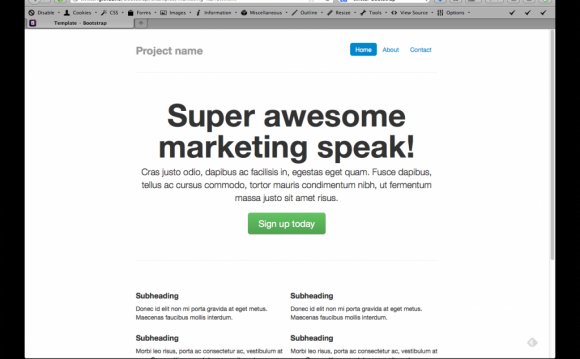
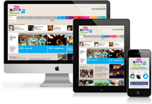
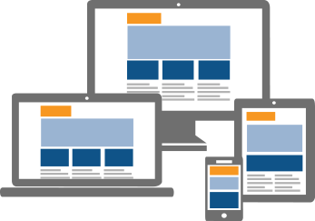
Mobile websites will redirect users on a specific device to a different site design for their device. While, a responsive website will simply adapt to your screen. Not only is responsive Web Design more user friendly, but it’s also better
for Search Engine Optimization. Google has released that the user experience is the most important aspect of search engine ranking. Having responsive Web Design allows for the best possible user experience. Another benefit of Responsive Web Design versus Mobile Web Design is that you only need one Search Engine Optimization campaign. Rather than one dedicated to your mobile site and a different to your desktop site.
Responsive Web Design, as suggested by Google, allows a singular website to provide the best user-experience across many devices and screen sizes and it also makes managing your SEO strategy easier. Responsive Web Design is the best option for your mobile SEO strategy. Call QuinnCom Web Design to discuss how your brand can develop a Responsive Web Site.
Go Mobile today with your business or organization and join the movement. See how you can benefit from having a mobile app.
Responsive Web Design Differs From Mobile Websites
To see it for yourself, re-size your browser on our site. You’ll notice how images and text adjust to fit to your screen size! Responsive Web Design encompasses coding that works to Adjust Screen Resolutions, Hiding & revealing portions of images, Creating Sliding Composite Images, Foreground Image that scale with the layout and stop the iPhone image resizing.
Share Friendly
Having one URL makes websites easier to share on social media and to differing devices. If you Share a mobile URL, your desktop user will not have the same comfortable experience that you do. Responsive Web Design allows for this singular URL to provide preferred viewing.
SEO Benefits
Google released a statement to it’s Webmasters & Developers that they recommend Responsive Web Design, “sites that serve all devices on the same set of URLs, with each URL serving the same HTML to all devices and using just CSS to change how the page is rendered on the device.”
Simple Analytics
A single URL for Websites means only one set of data to interpret, examine, and report. Additionally, the same content will be available to every user. The integrated reports allow easier conversion paths and funnels to figure out where improvements need to be made.
Common Code Practice
As many web developers will tell you, less is better. A Responsive Web Design is implemented with a single set of source code, which means any changes can be made in just one place and seen by all visitors to the site, reducing the costs and time to update the website.
Higher Conversion Rates
You made a website for your business for one reason- to get more customers! Creating your Responsive Website will let you reach the 91% of Americans who own a cell phone that may be looking for your business. Don’t miss out on potential customers for a lack of a mobile ready site.
YOU MIGHT ALSO LIKE


Share this Post
latest post
-
-
 Web Page Designer Definition September 29, 2018
 -
-
 What is the best Web design software? September 23, 2018
 -
 Best Web design colors September 20, 2018
 -
 Online Responsive Web design September 17, 2018
 -
 Web Page design Perth September 14, 2018
 -
 Best PC for Web design September 11, 2018
 -
 Best Practices for Web design September 8, 2018